Nike
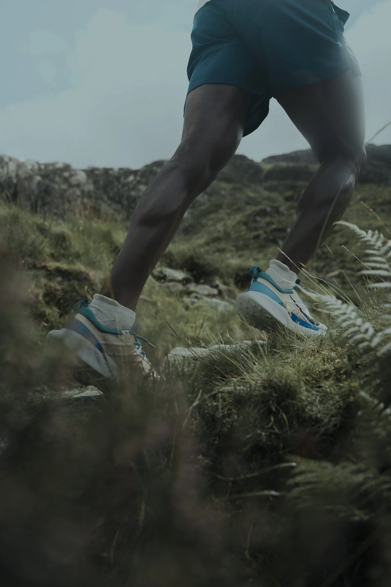
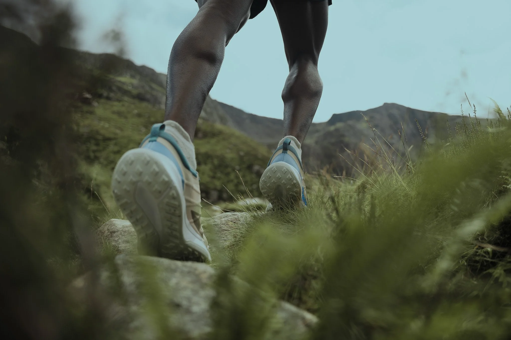
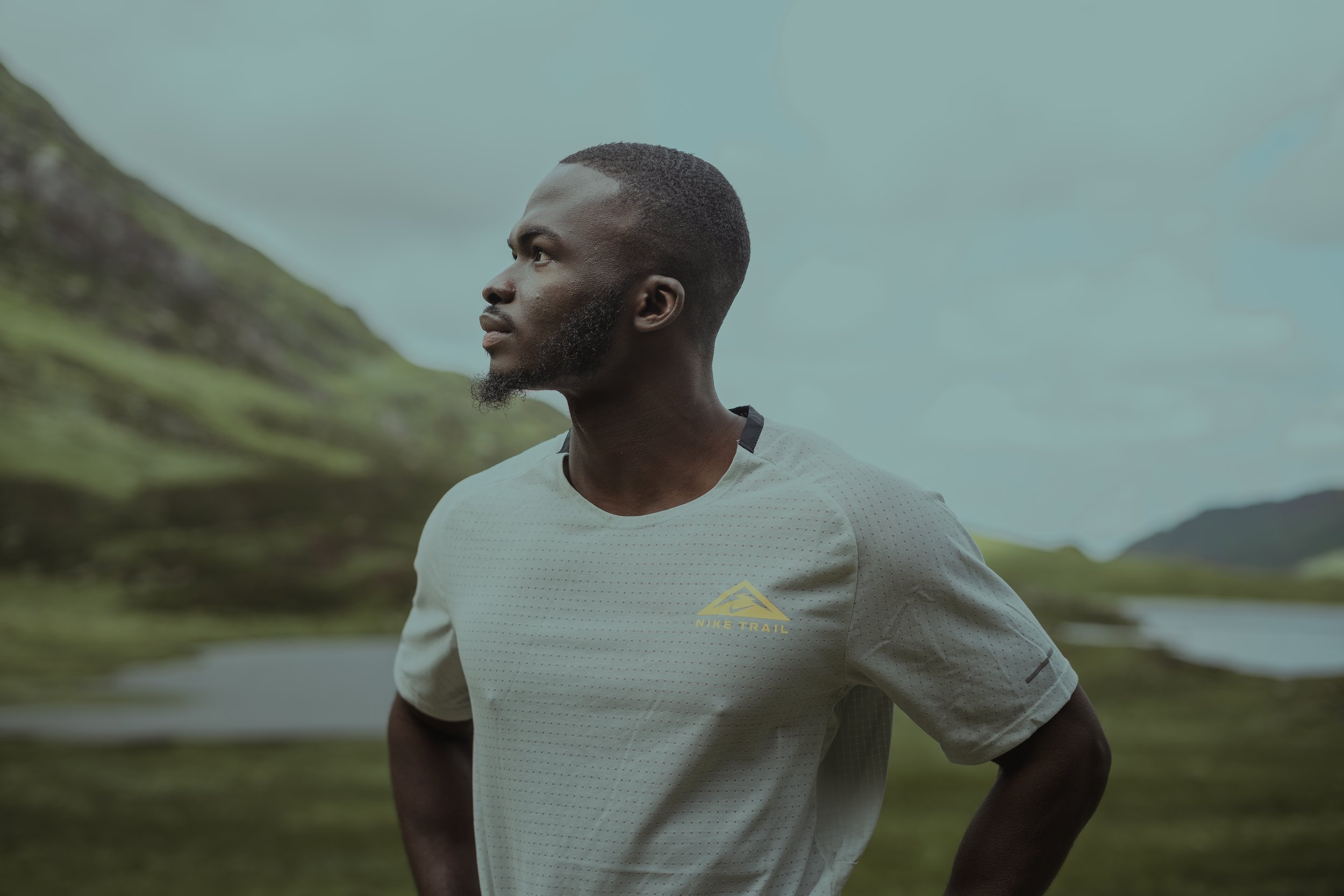
From the start, the approach was rooted in understanding how Nike communicates. The brand speaks through confidence, movement, and clarity. The imagery needed to feel bold and immediate, with a strong sense of purpose. Every visual decision was made with reach, recognition, and shareability in mind.
Before shooting, I planned the project around how the images would live on social media rather than treating them as standalone photographs. That meant thinking in terms of formats, crops, pacing, and how each image would perform in a fast-moving feed. The goal was to create content that stops attention without feeling forced or overdesigned.
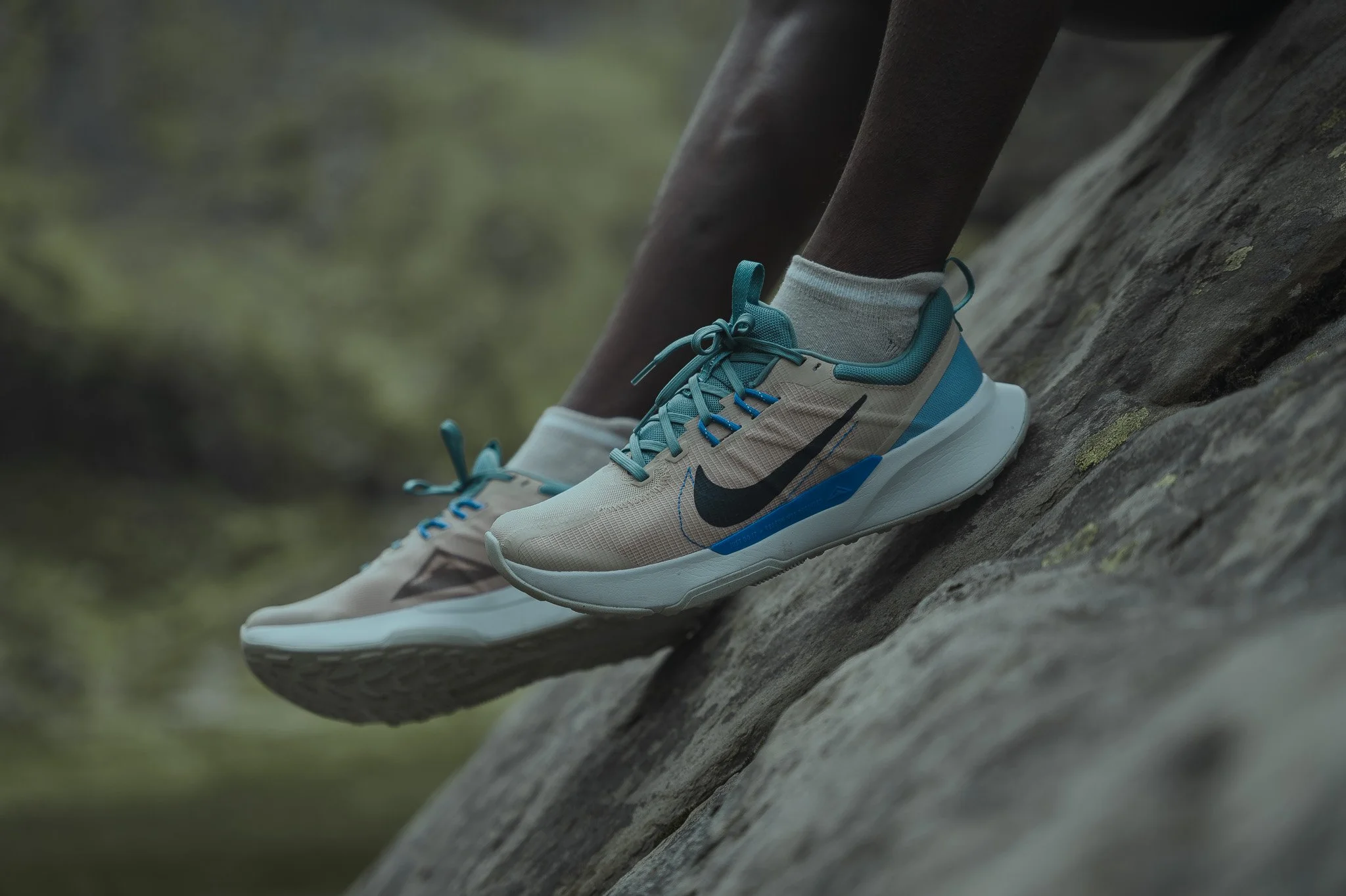
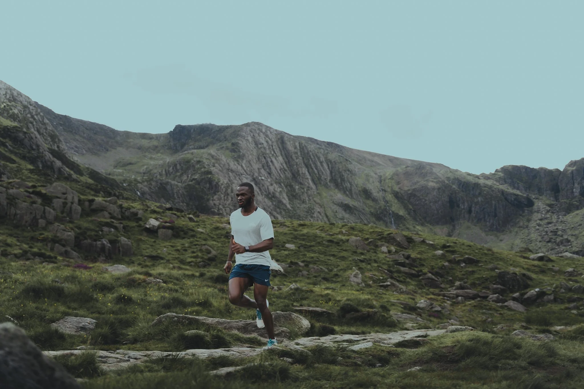
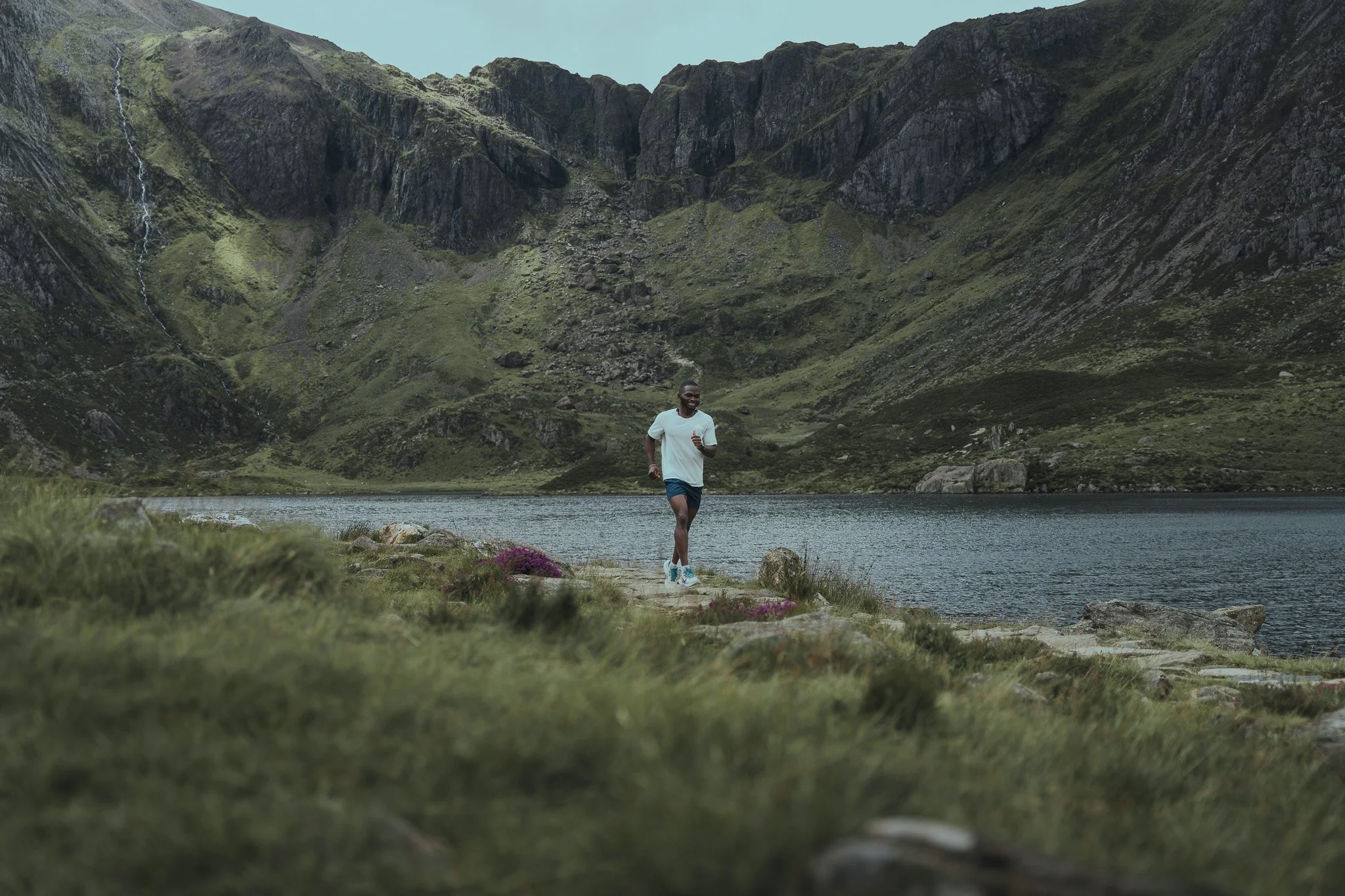
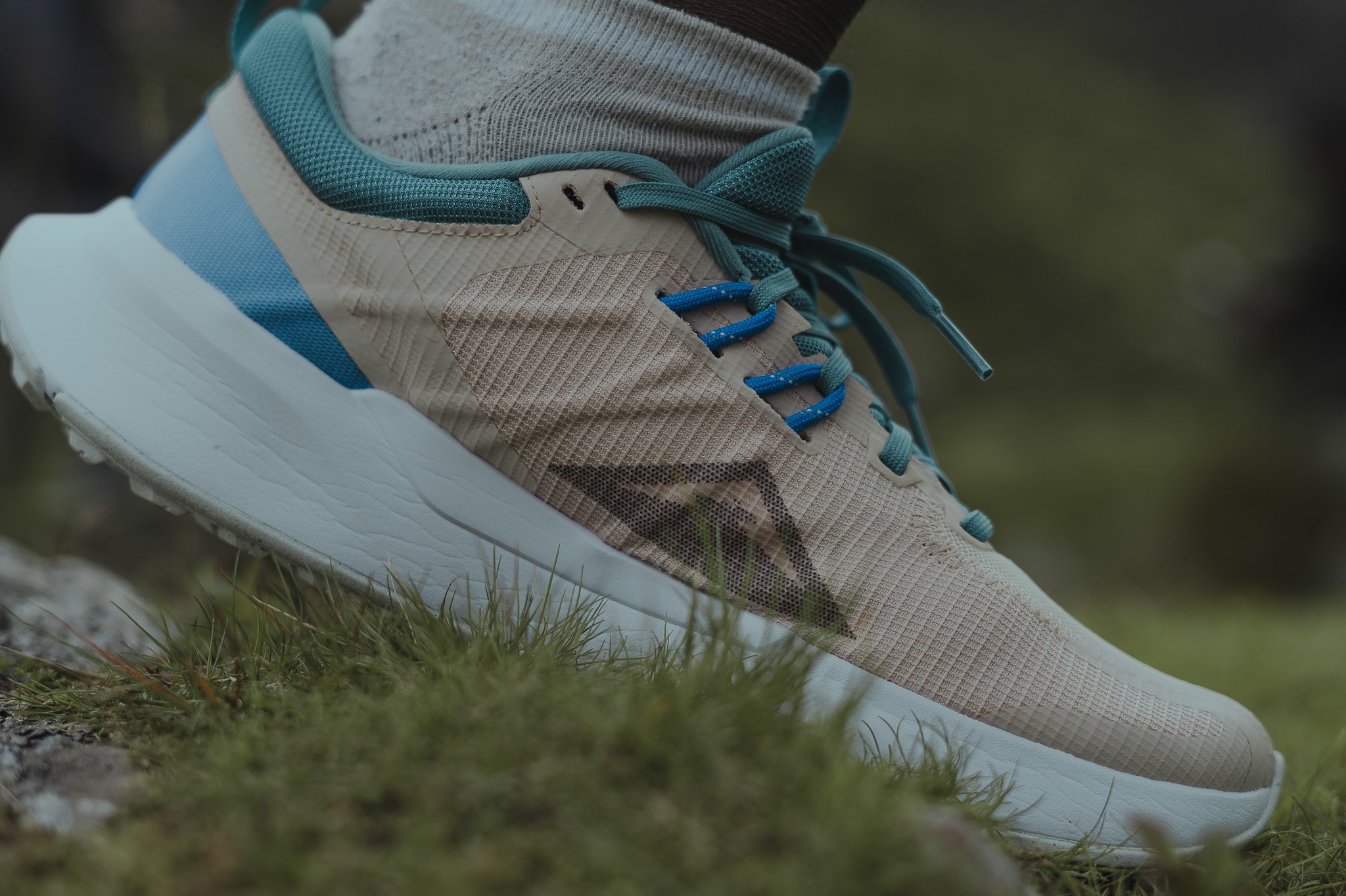
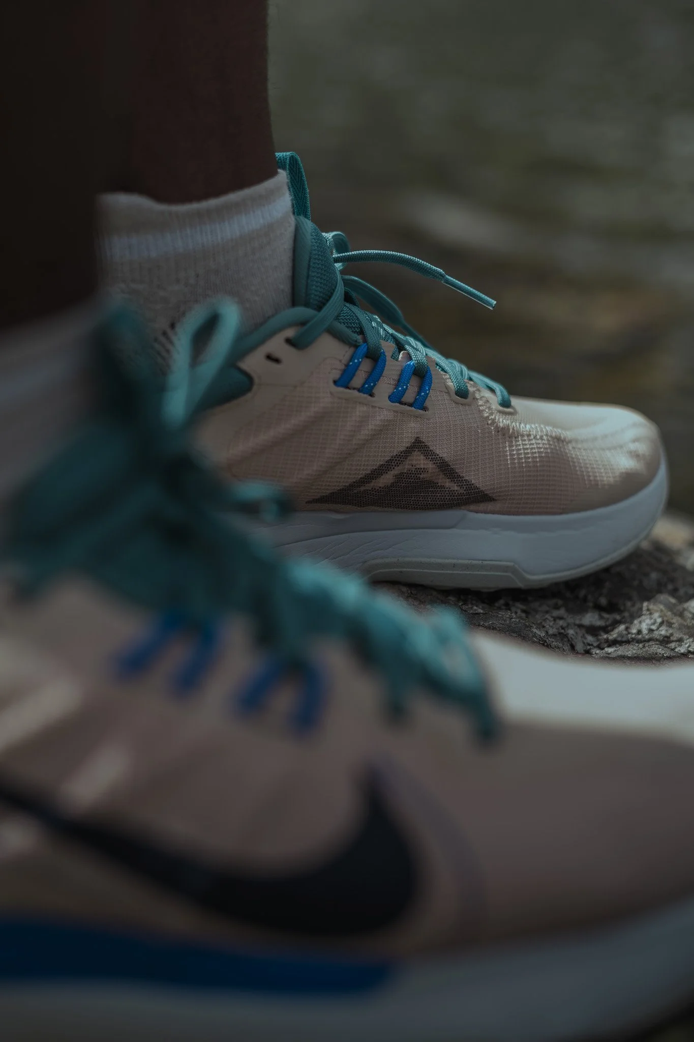
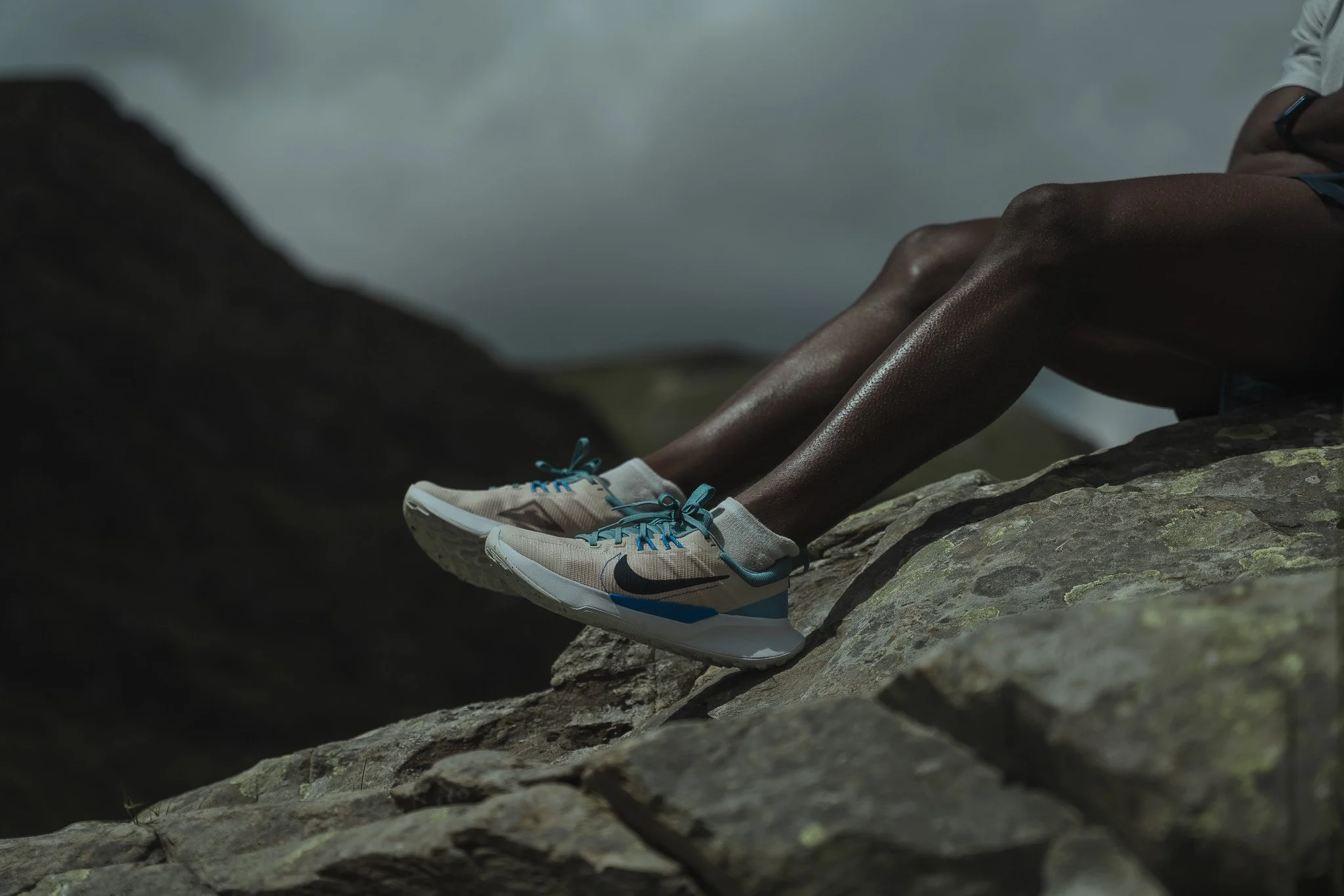
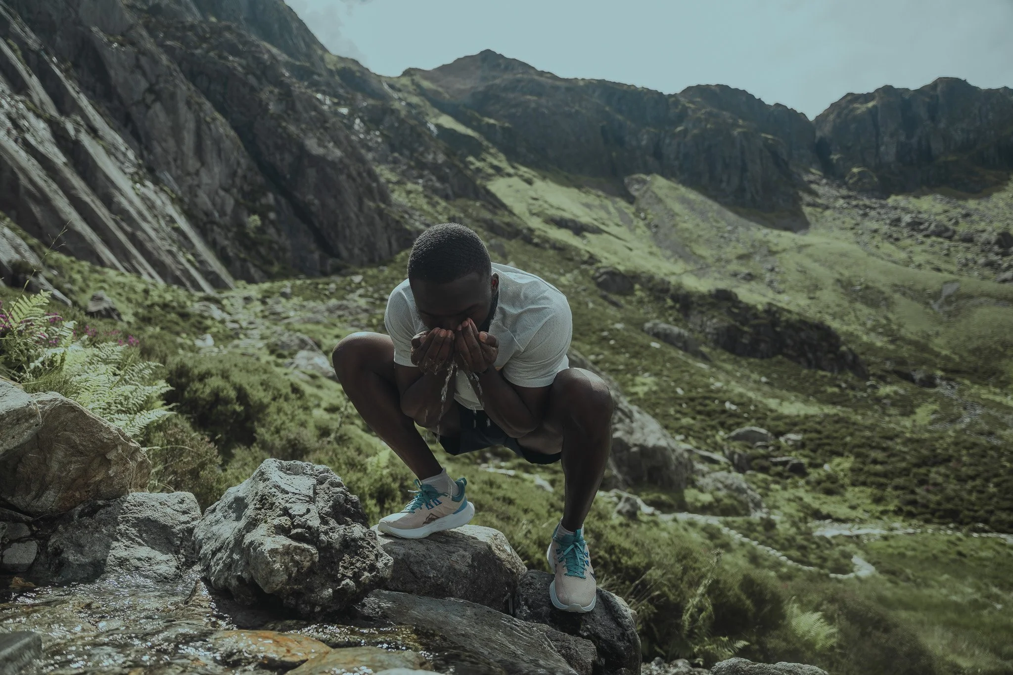
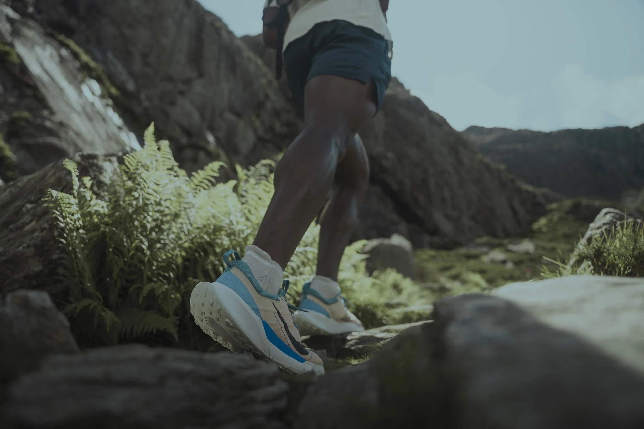
The photography itself focused on clean compositions with strong visual impact. I avoided unnecessary complexity and distractions, allowing the subject and product to remain central. Framing, angles, and spacing were intentional, designed to read clearly on small screens while still holding up at high resolution. Each image needed to communicate energy and confidence within seconds.
Lighting and contrast were used strategically to create punch and depth. Rather than soft or atmospheric treatments, the visuals leaned toward clarity and strength. This helped the images stand out in crowded digital environments and reinforced Nike’s bold, performance-driven identity.
Color grading played a key role in reach and recognition. The grading was designed to be crisp, modern, and consistent across the full set. Colors were controlled to ensure they felt strong without overpowering the subject. This consistency allowed the images to function as a cohesive visual system rather than individual posts, strengthening brand recall across multiple touchpoints.

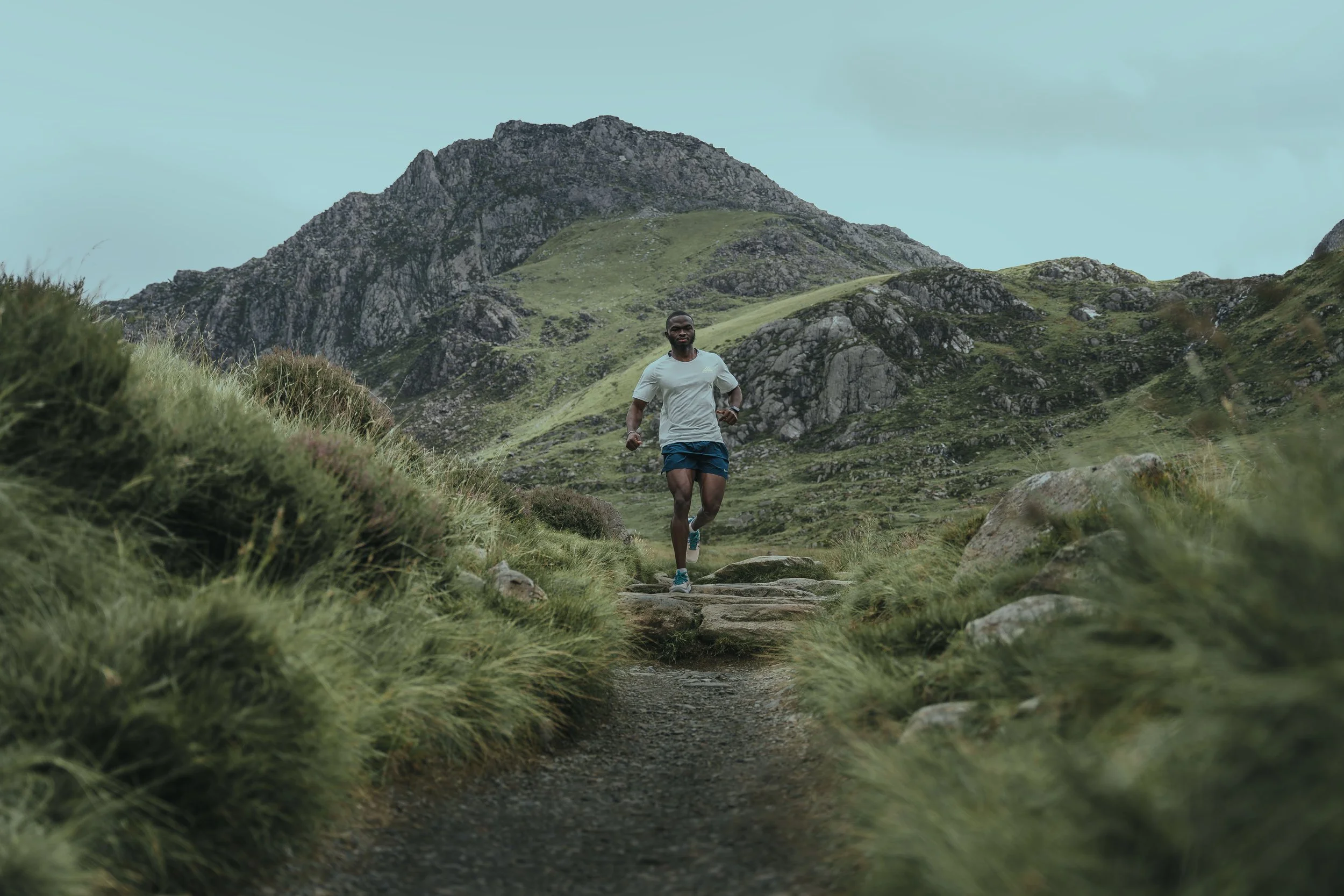
Nike From Wales
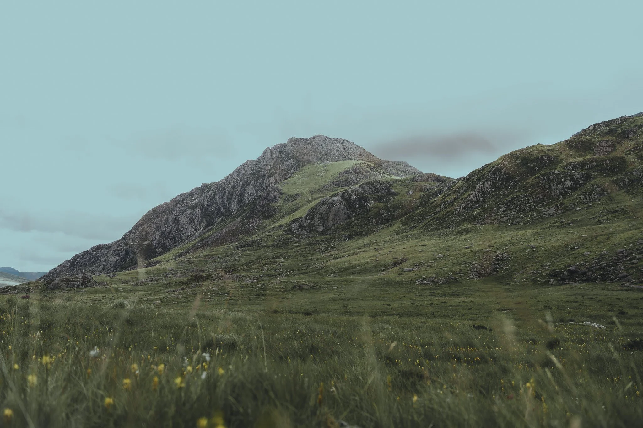
A visual study of movement, endurance, and quiet strength in open space.