Hotel Gleneagles
This project was centered on photographing Gleneagles’ luxury rooms with a clear internal objective: the visuals needed to represent the property at a level that felt credible, refined, and confident in front of the management team. The focus wasn’t volume or trend-driven content. It was precision, restraint, and alignment with the brand’s standards.
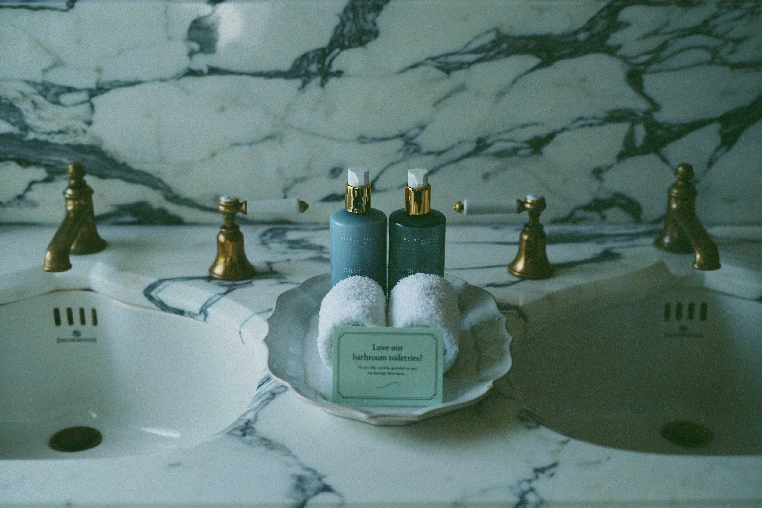
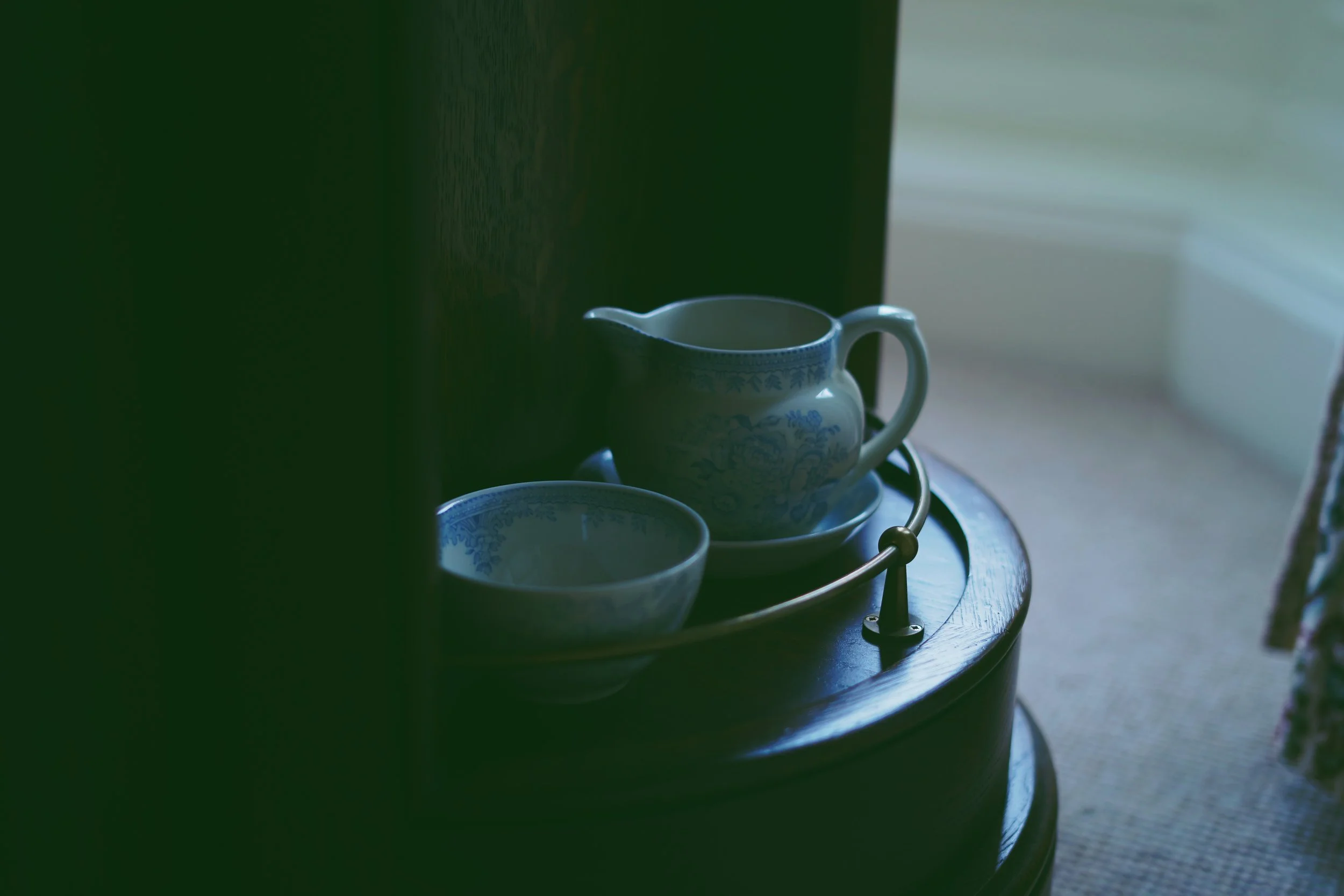
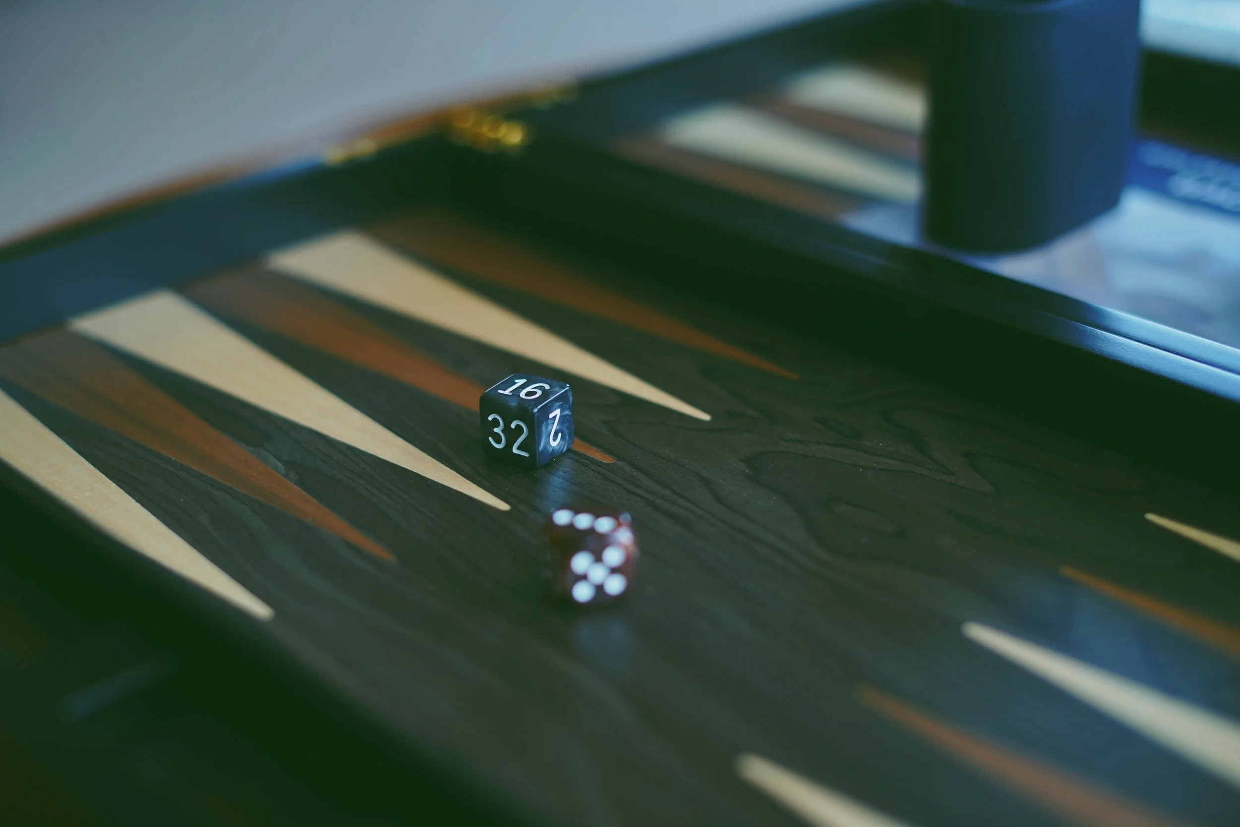
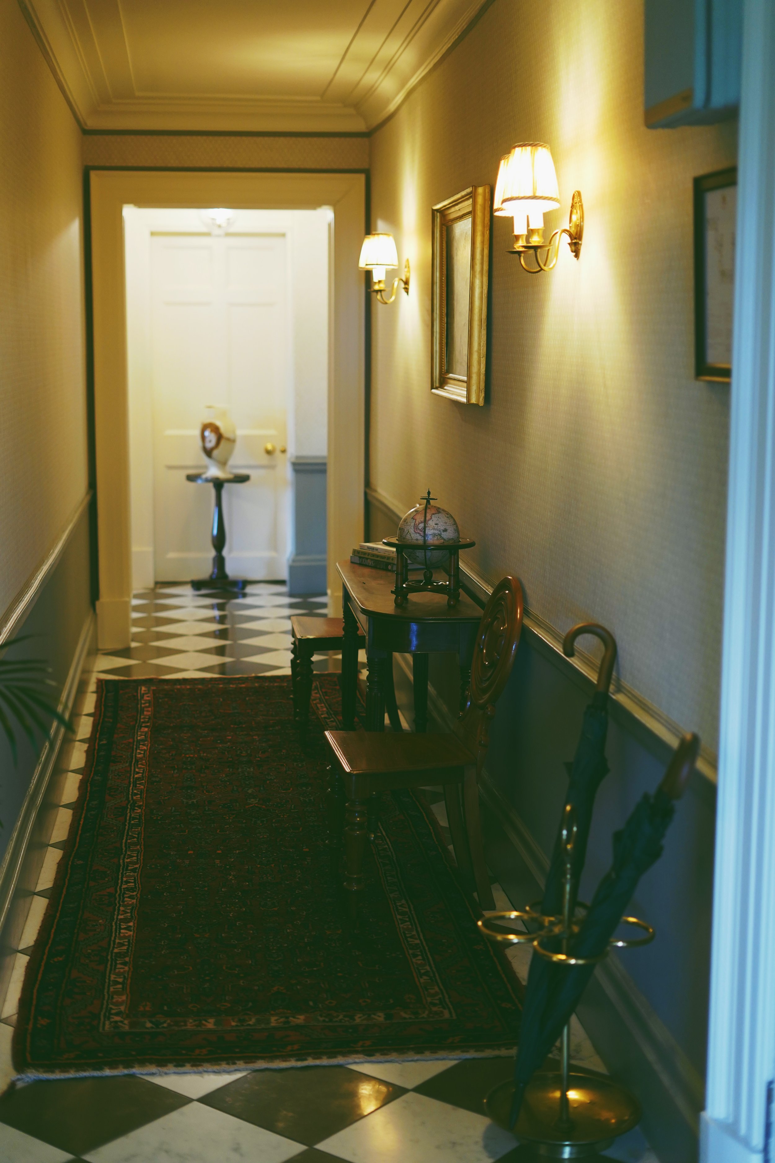
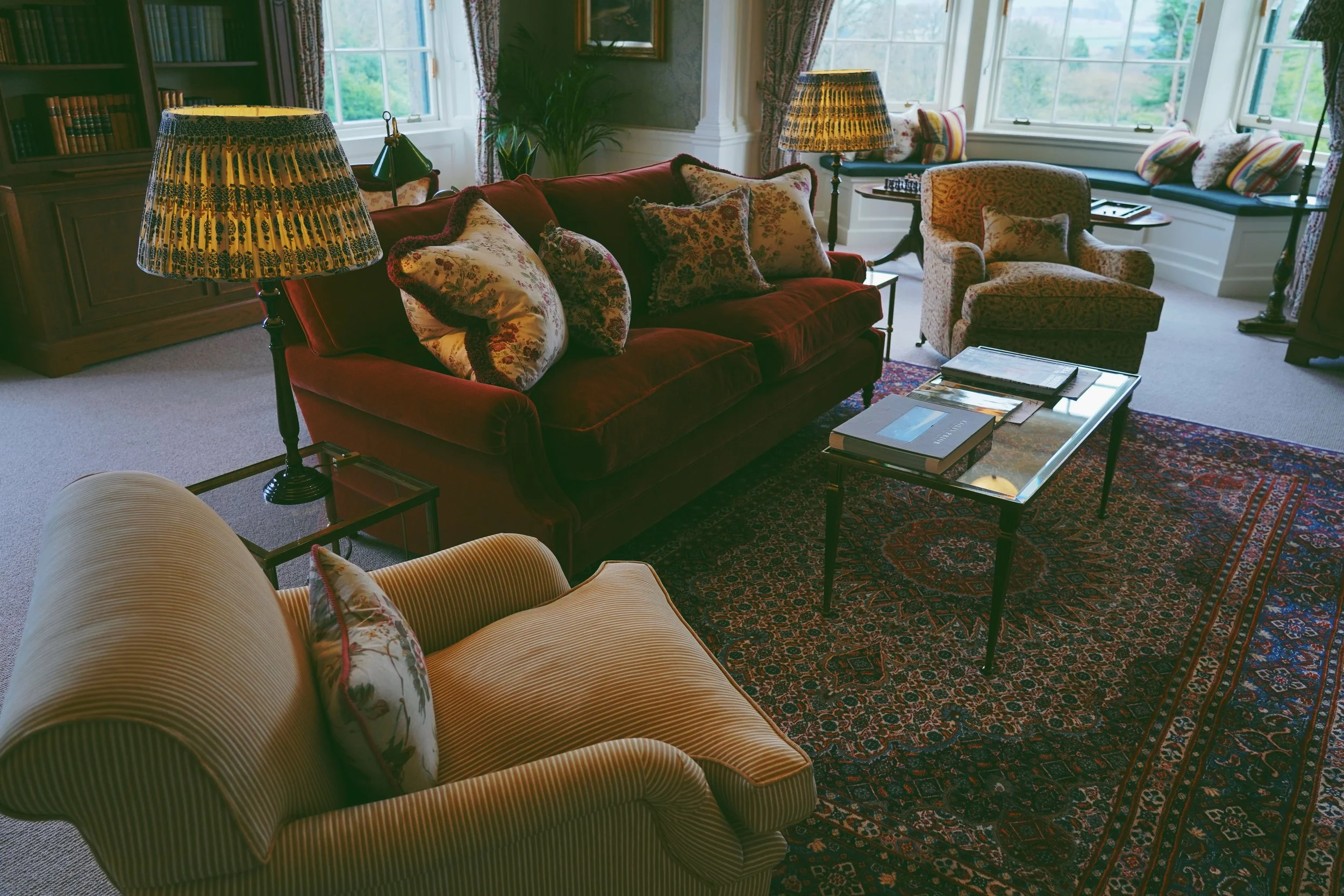
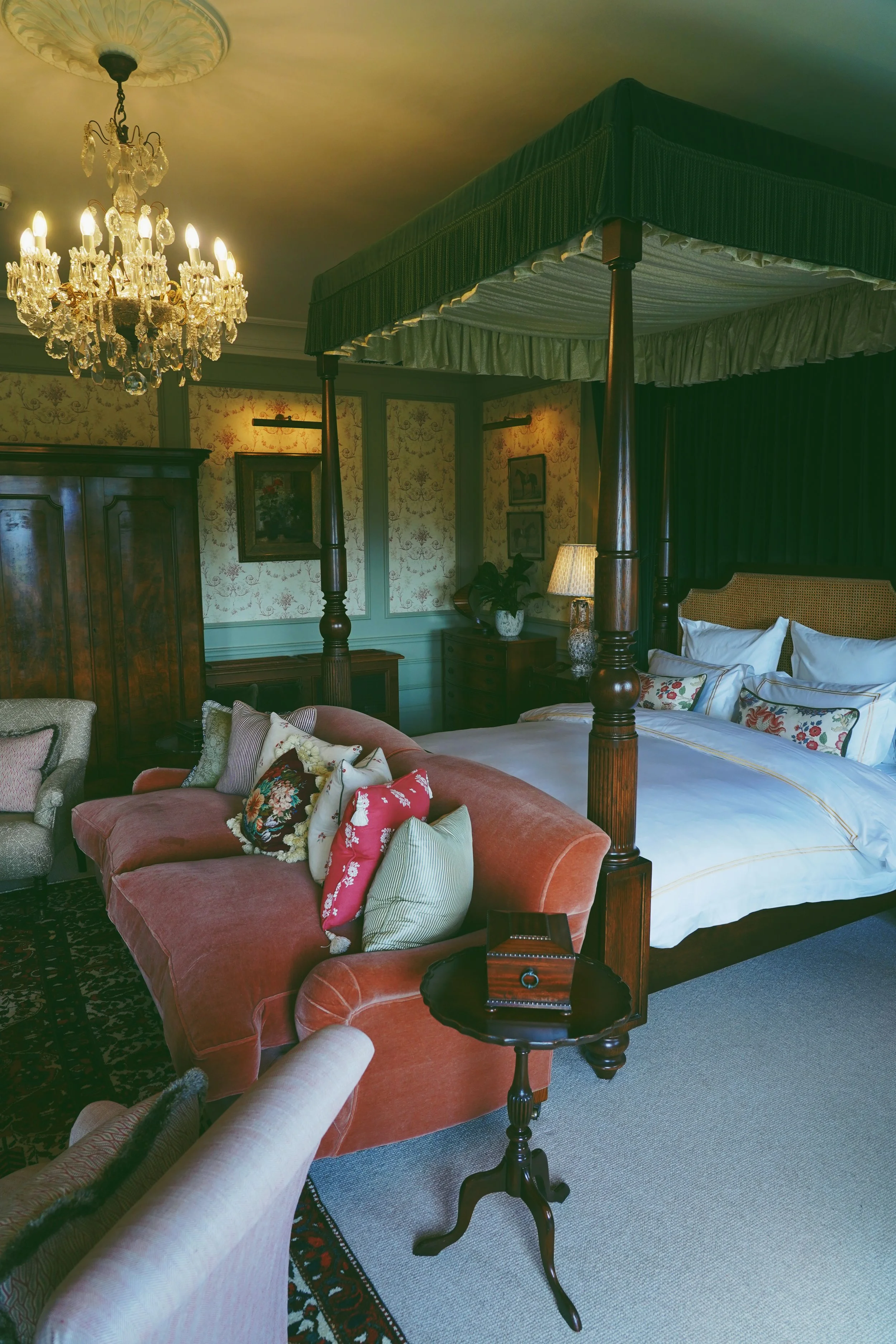
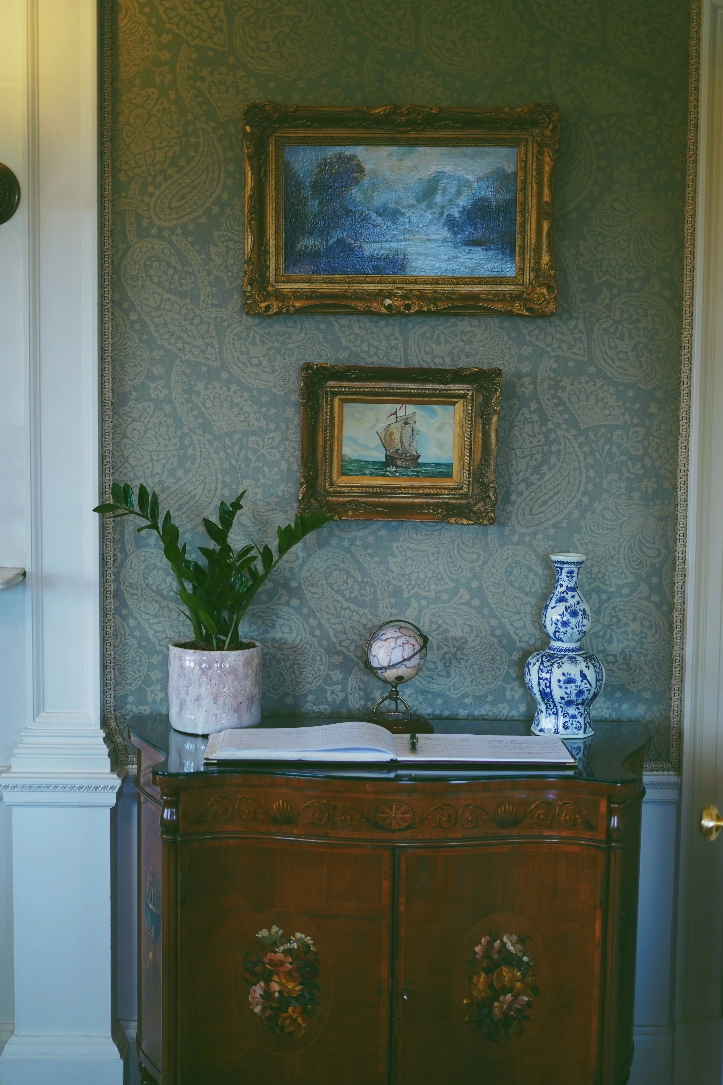
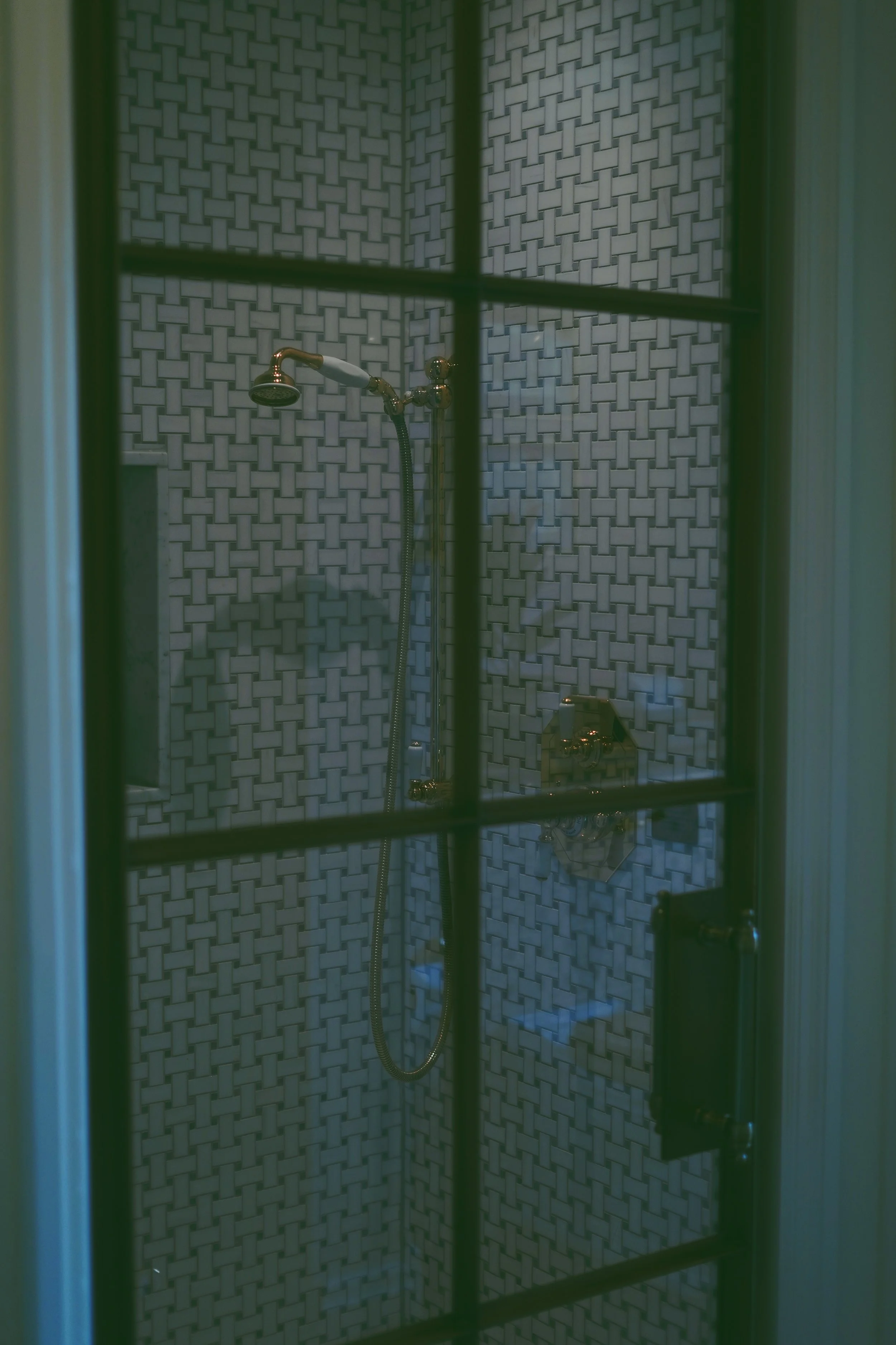
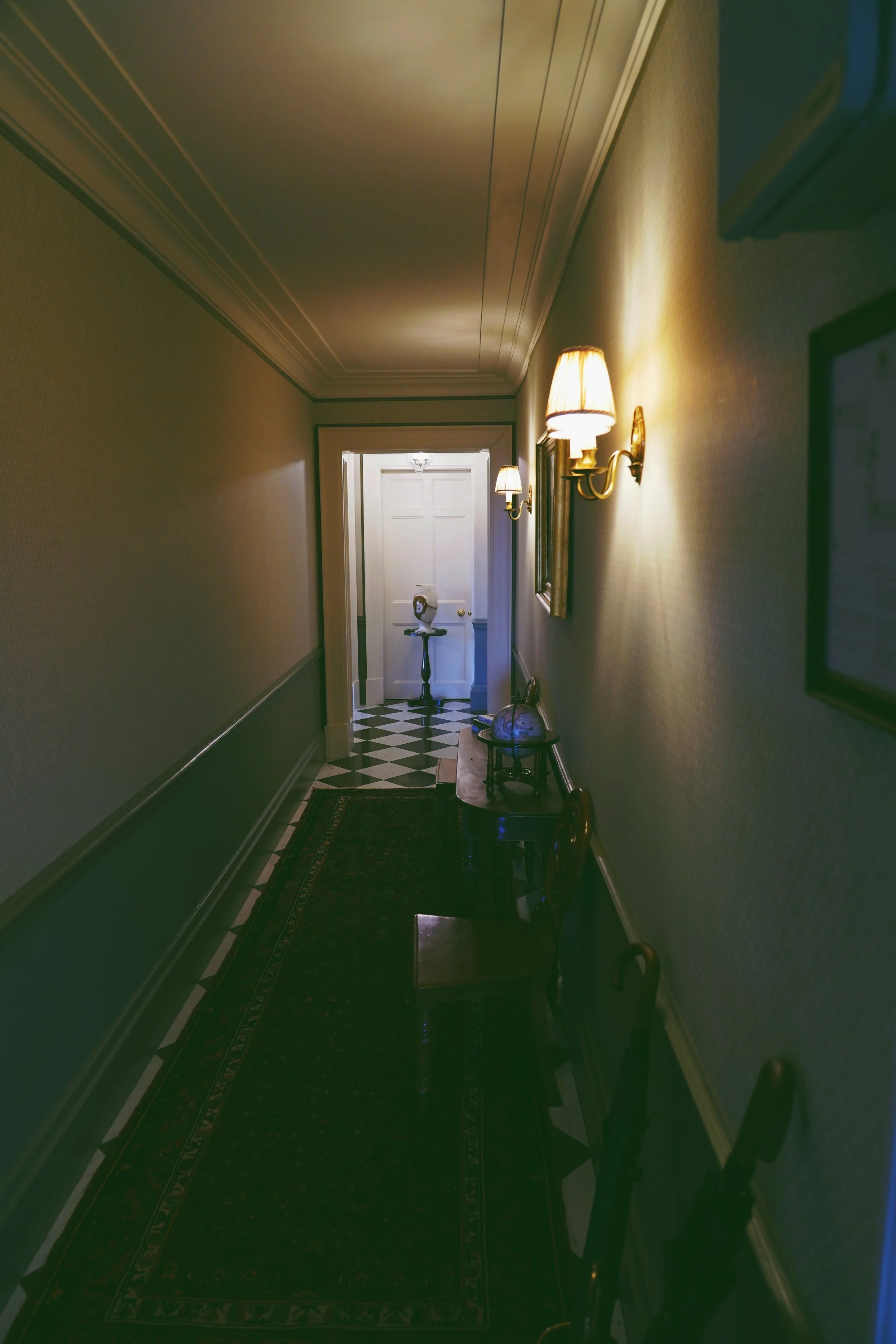
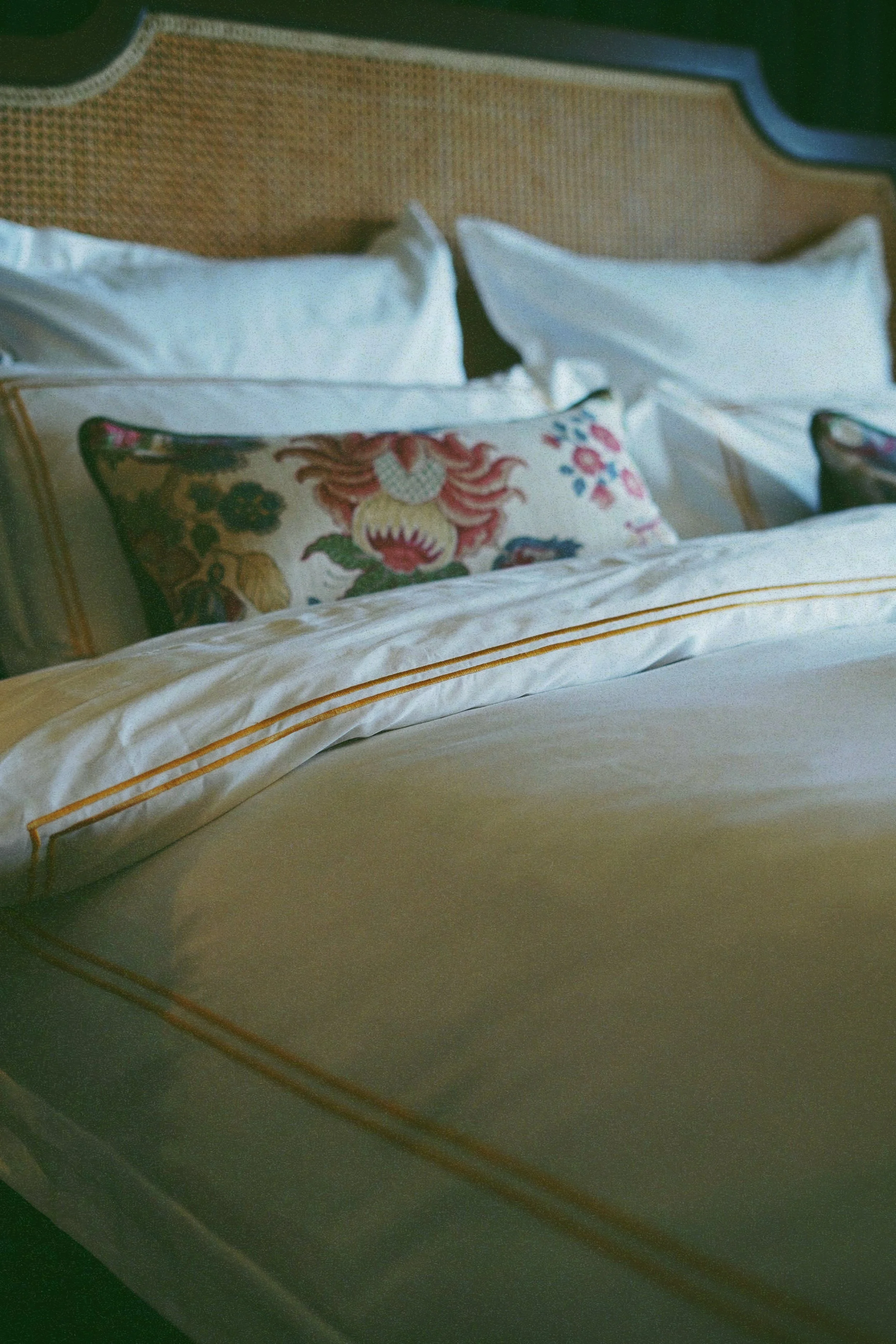
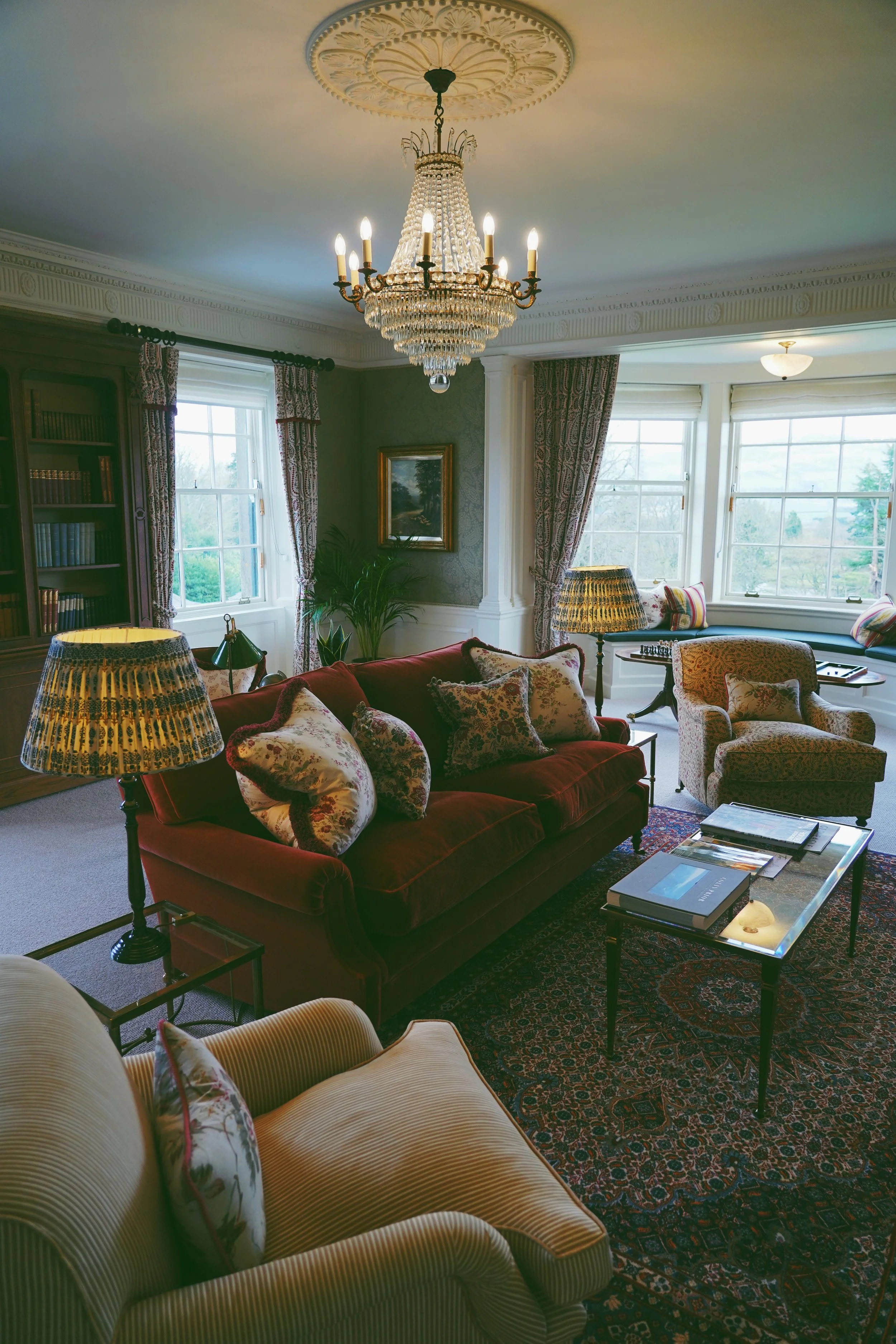
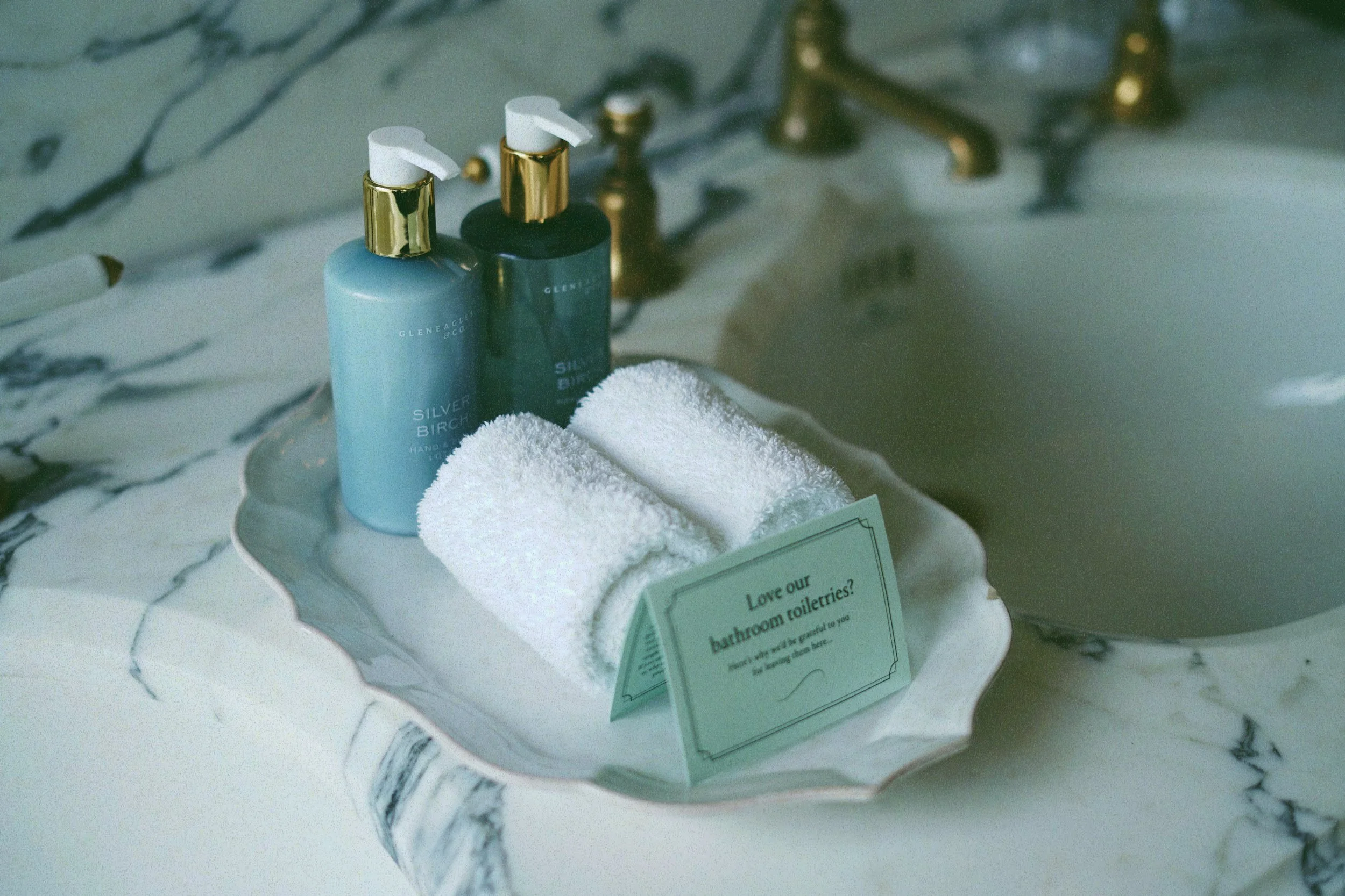
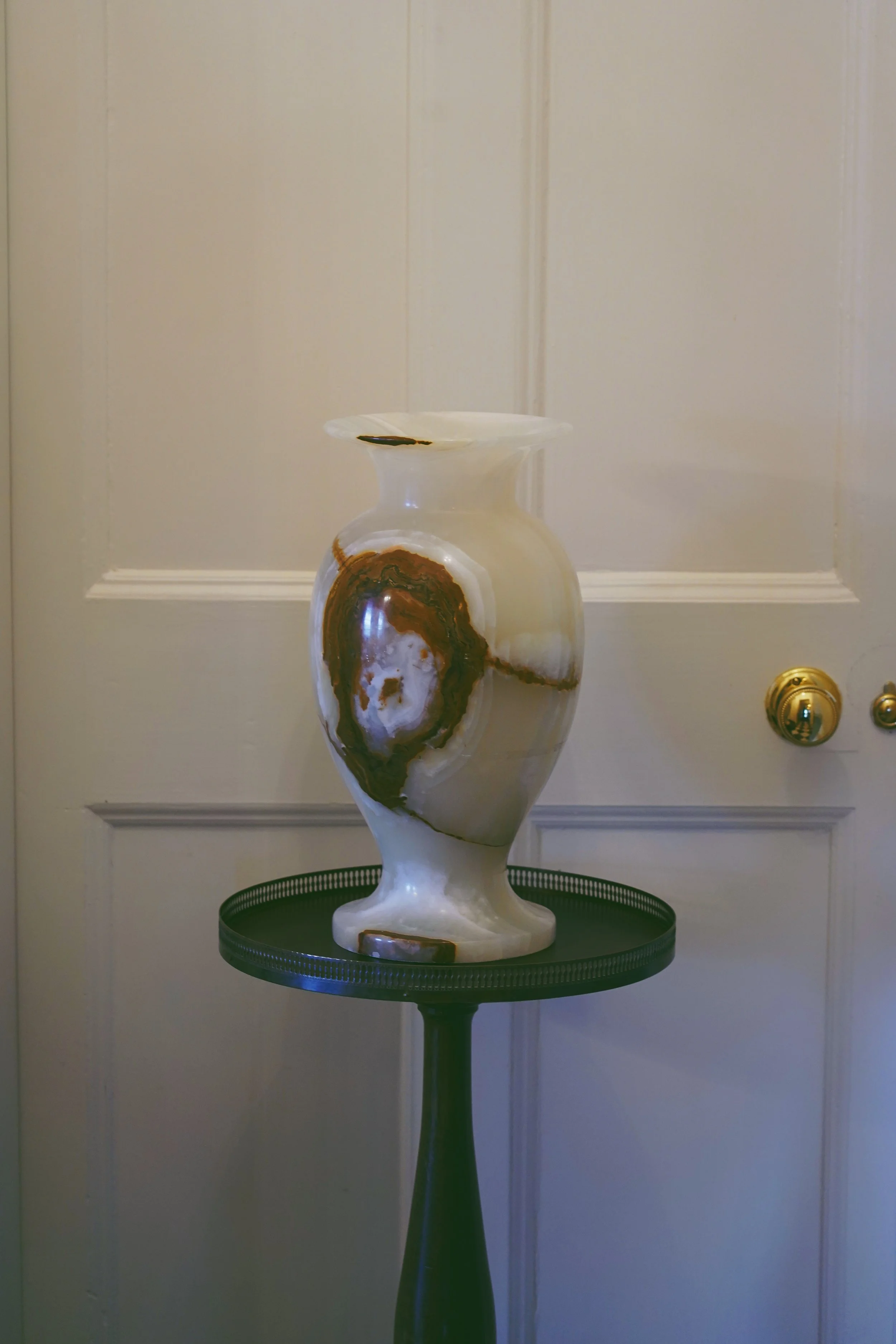
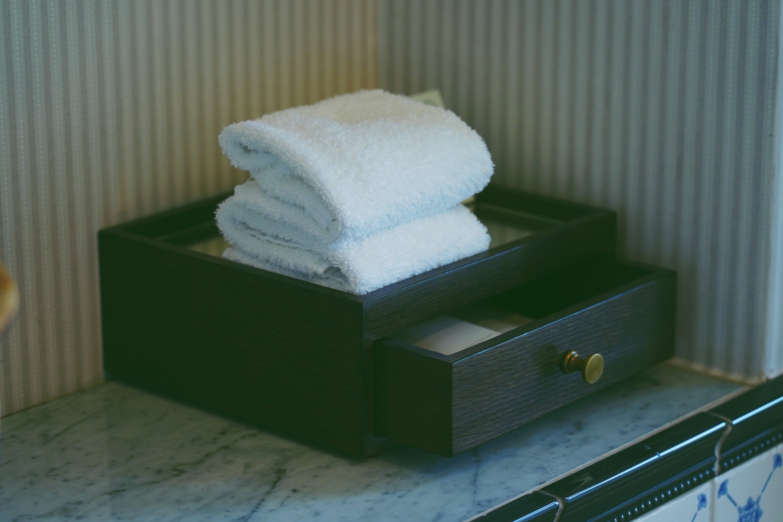
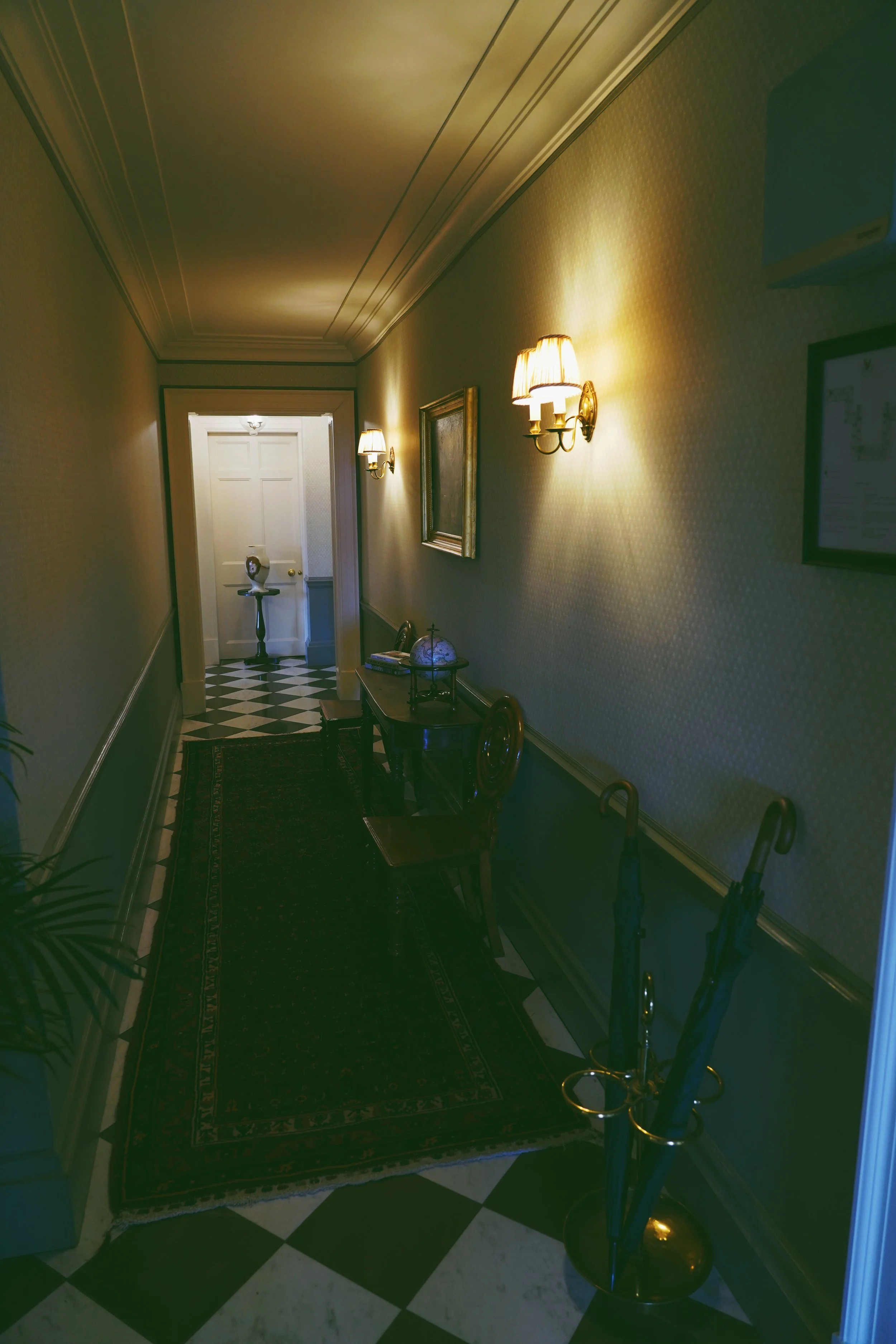
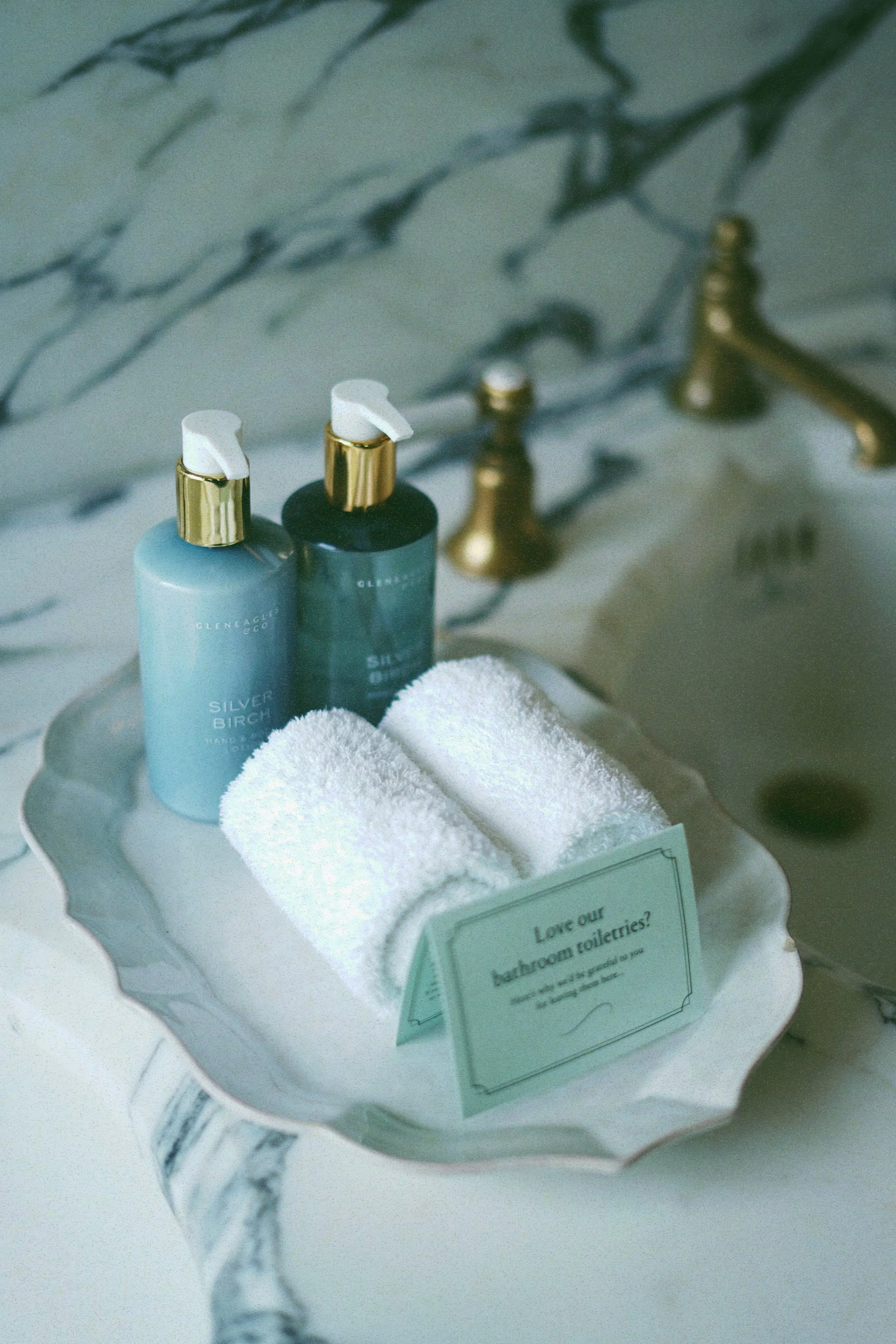
Before picking up a camera, the work began with understanding how the hotel wanted to be perceived internally and externally. Gleneagles already has a strong reputation, so the challenge wasn’t to reinvent its image, but to translate its physical experience into visuals that felt elevated, intentional, and unmistakably premium. The rooms needed to communicate quiet luxury, attention to detail, and timelessness—without exaggeration.
The department was clear that this content would reflect directly on their professionalism and creative judgment when presented to management. That shaped every decision. The photography needed to feel composed, polished, and confident. Nothing overly dramatic. Nothing casual. Every frame had to feel like it belonged in a brand that values heritage, precision, and consistency.
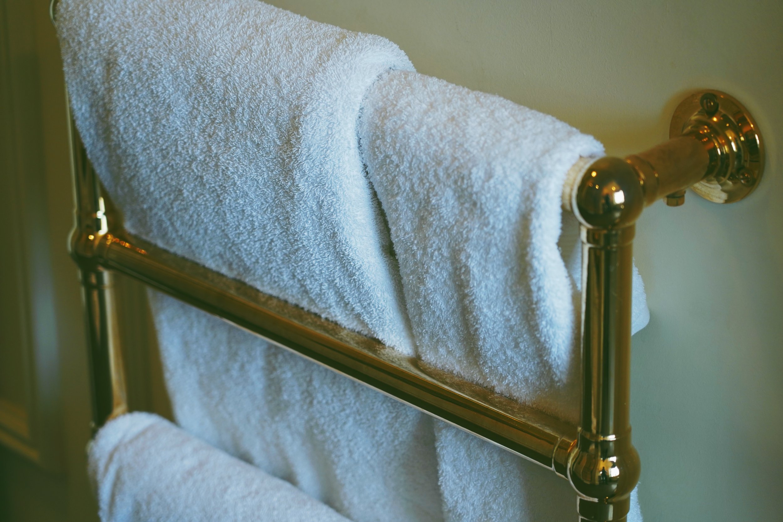
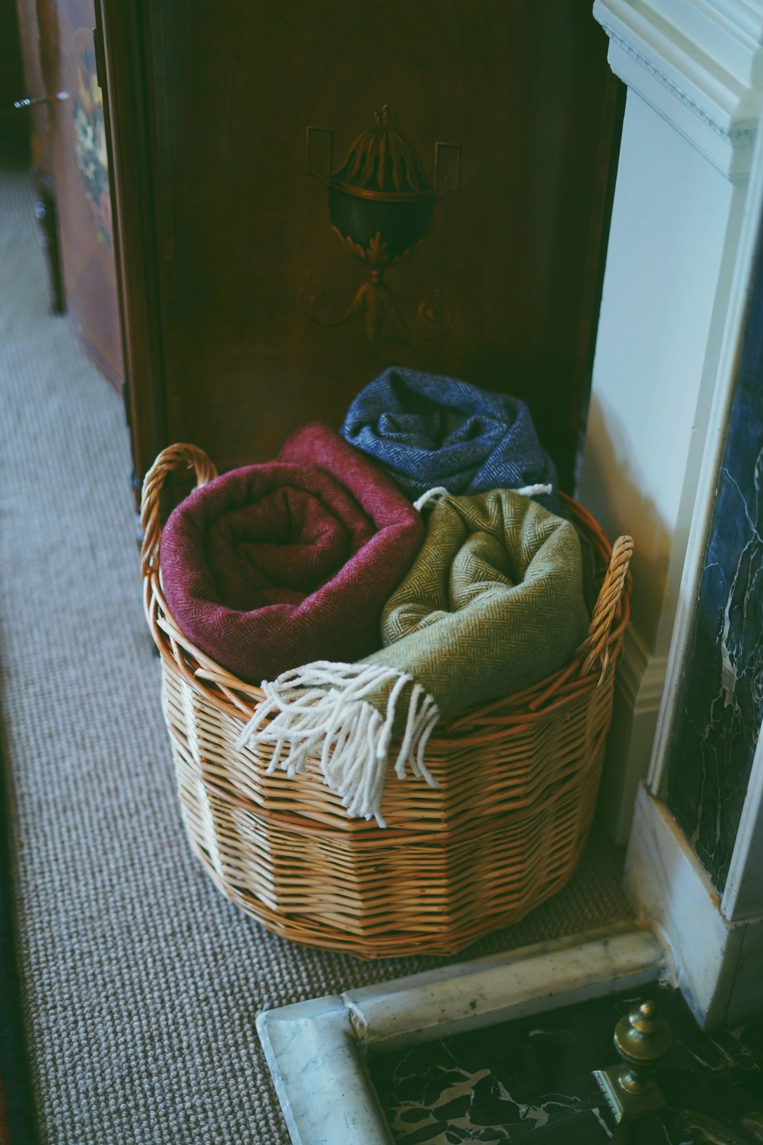
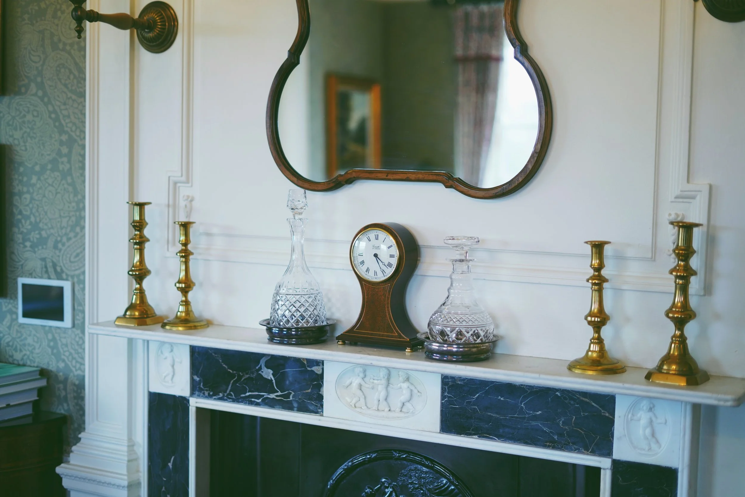
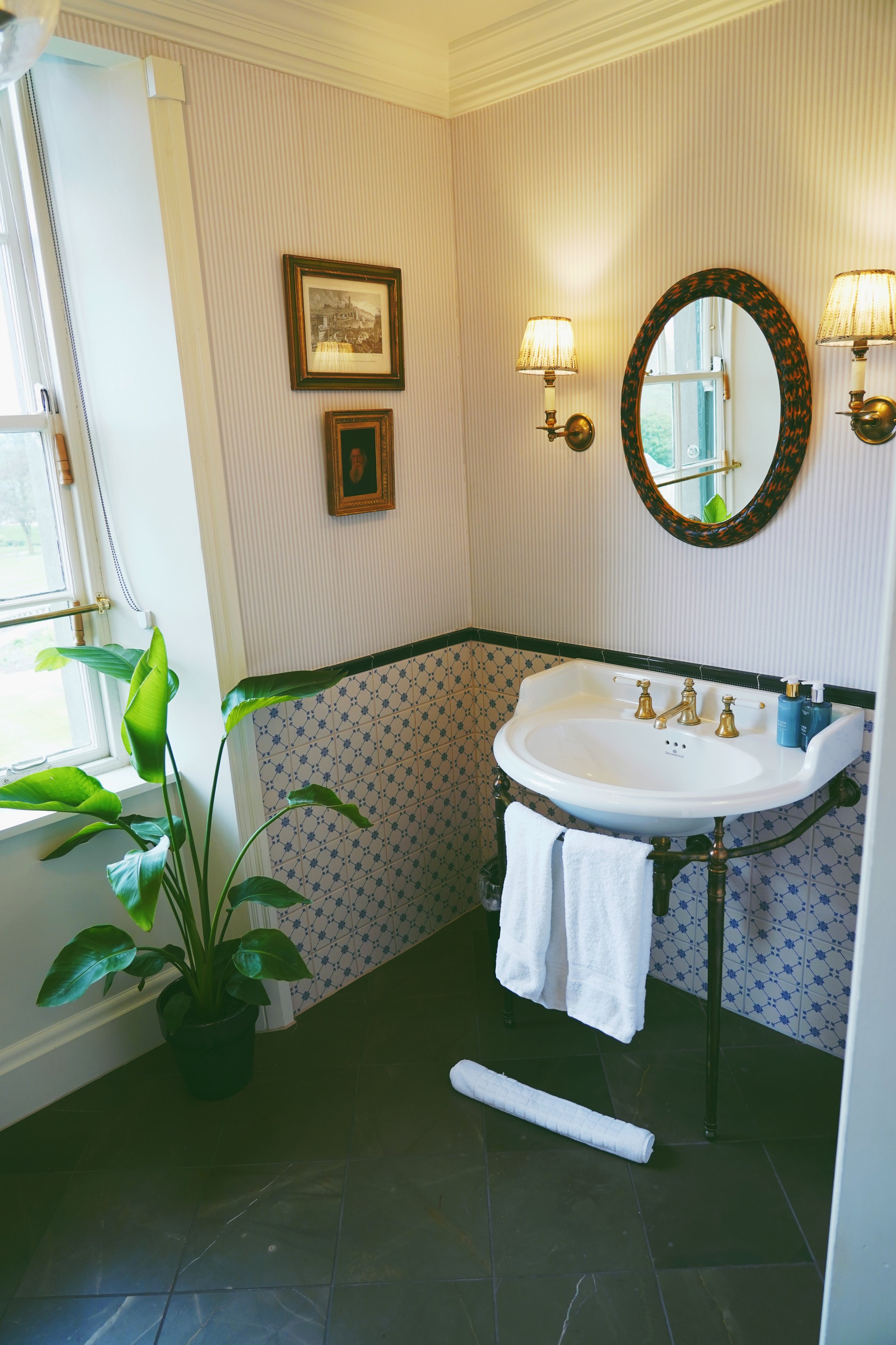
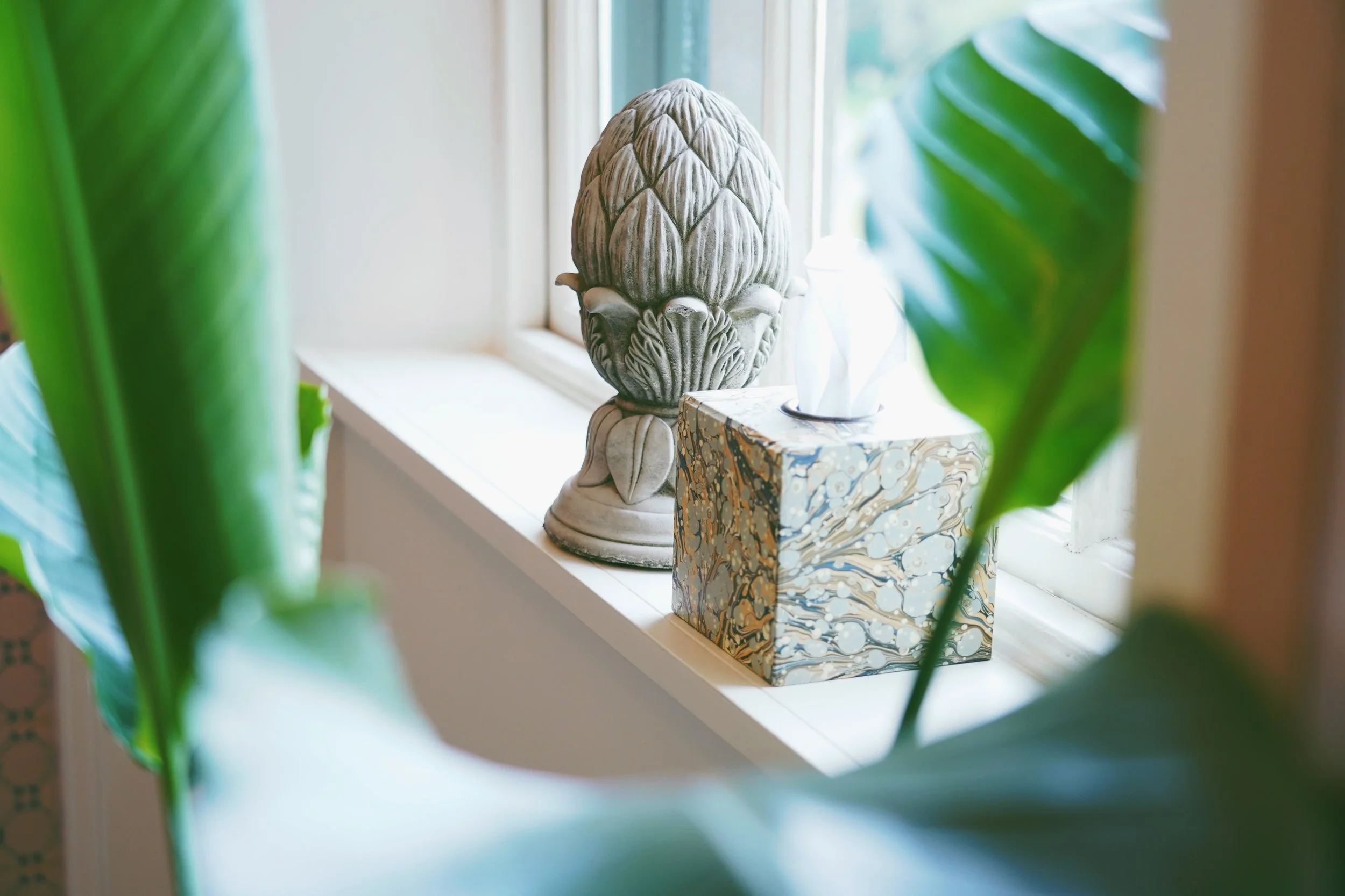
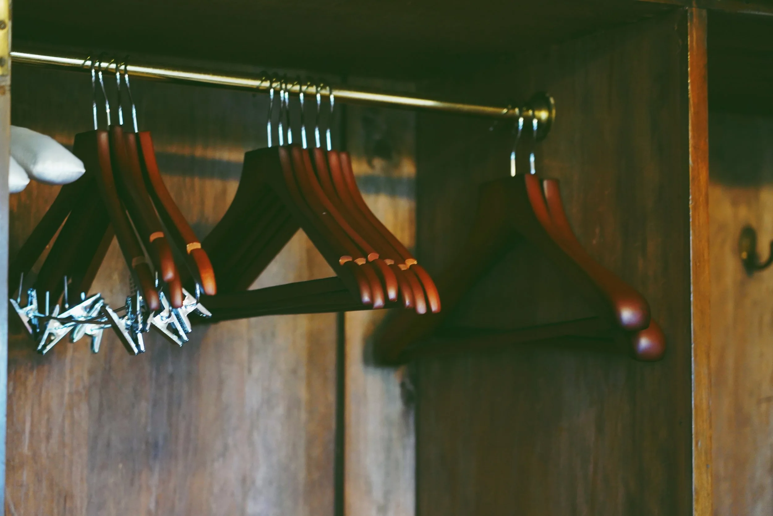
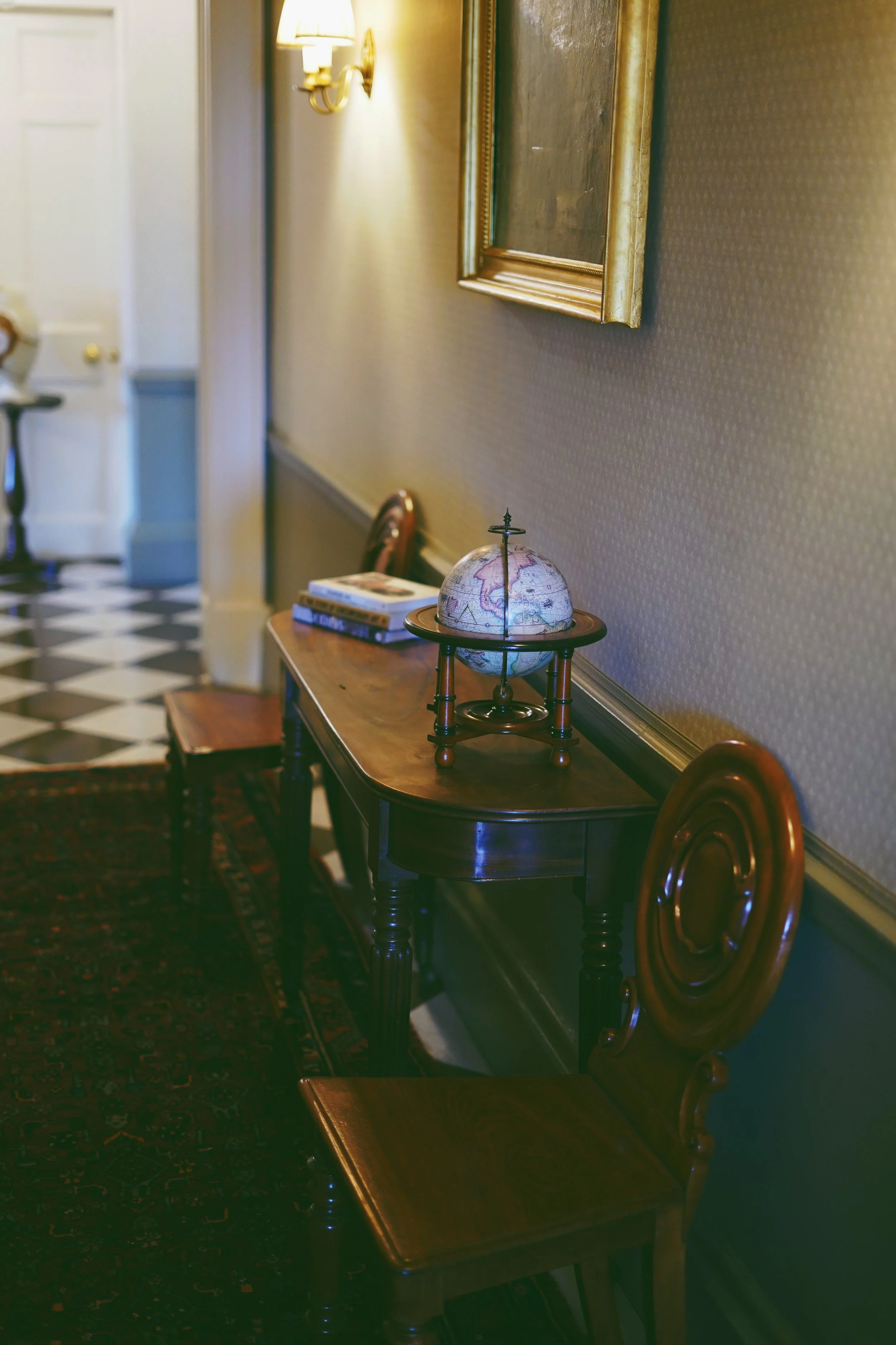
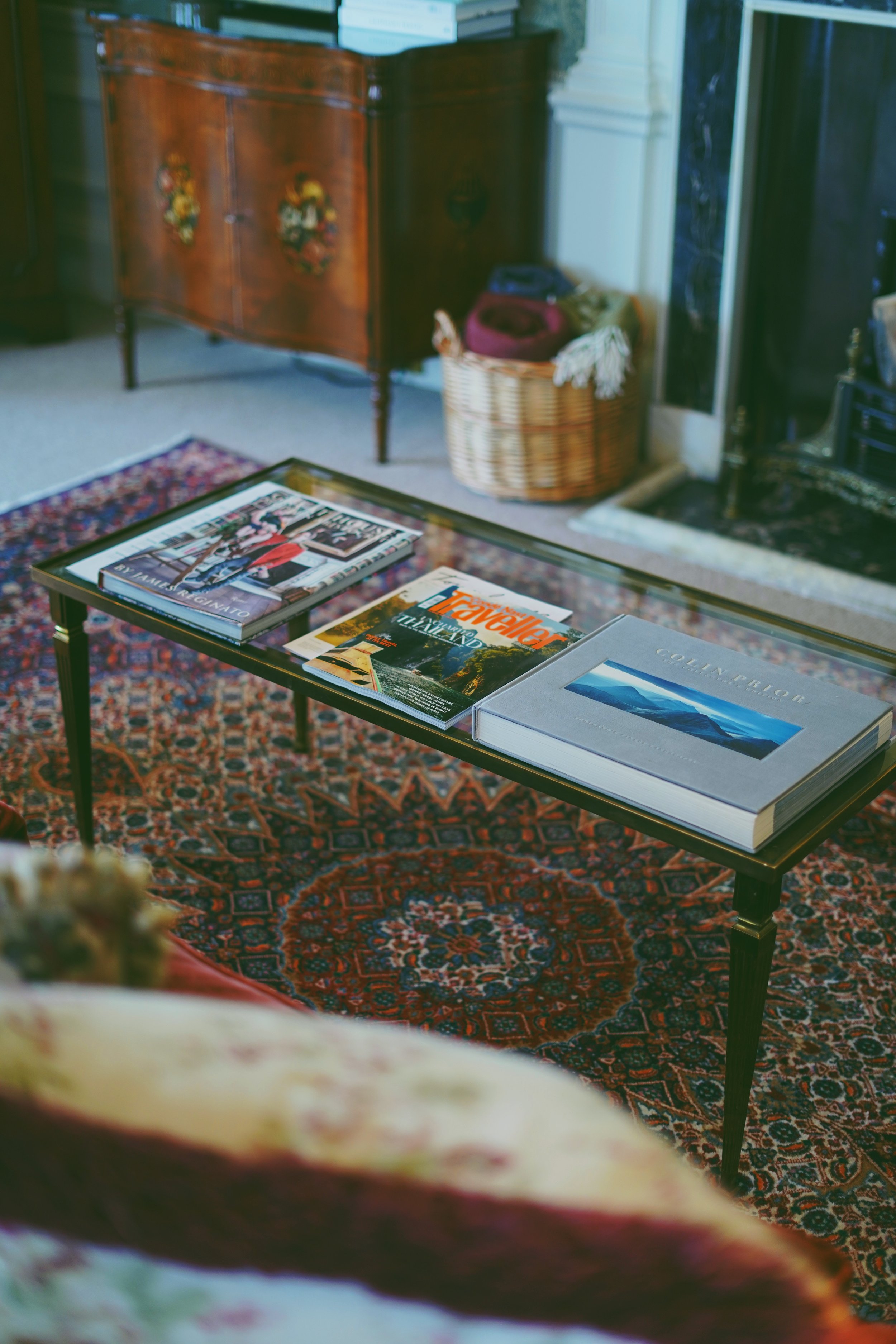
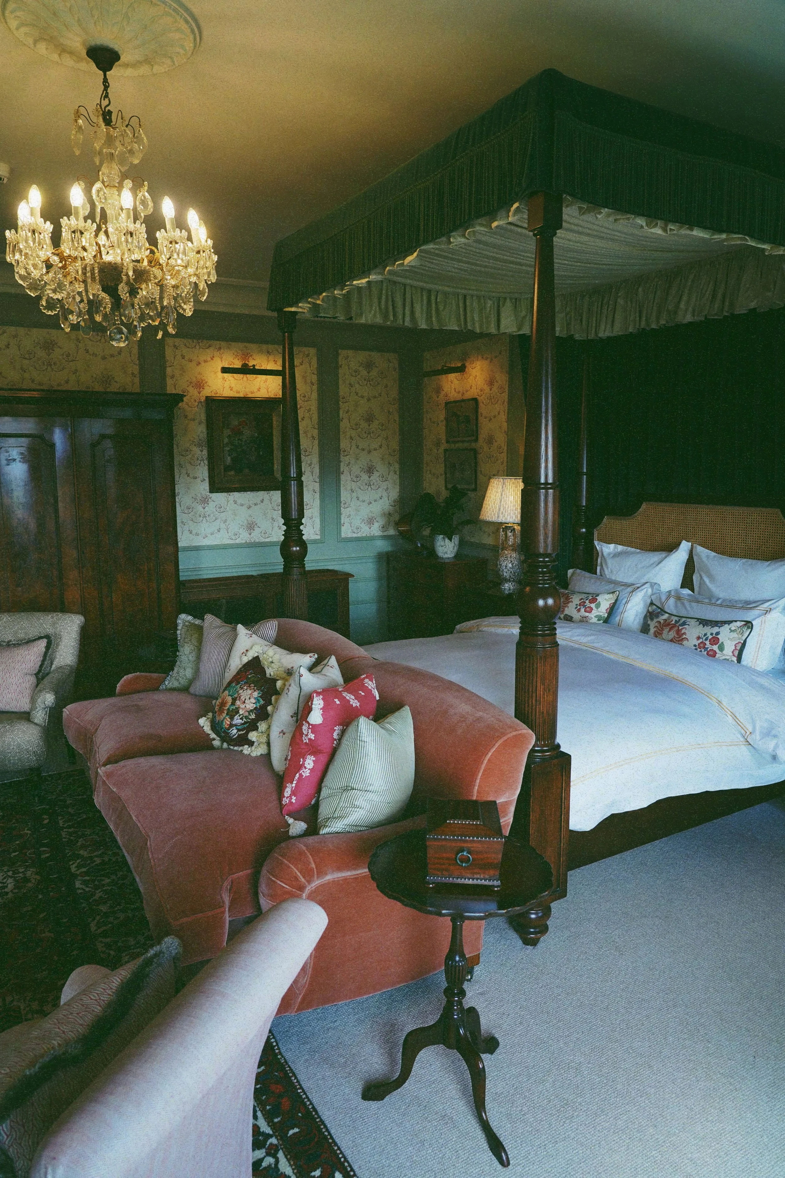
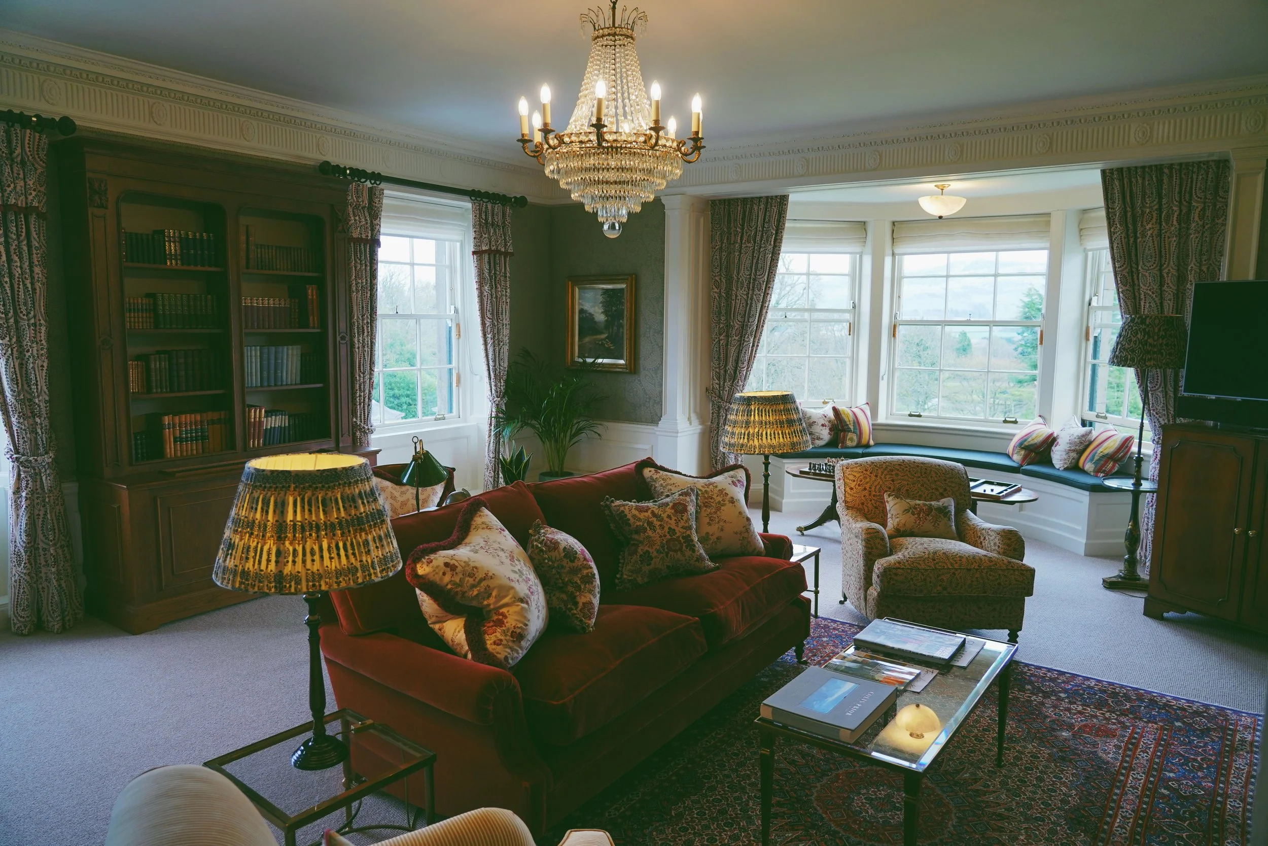
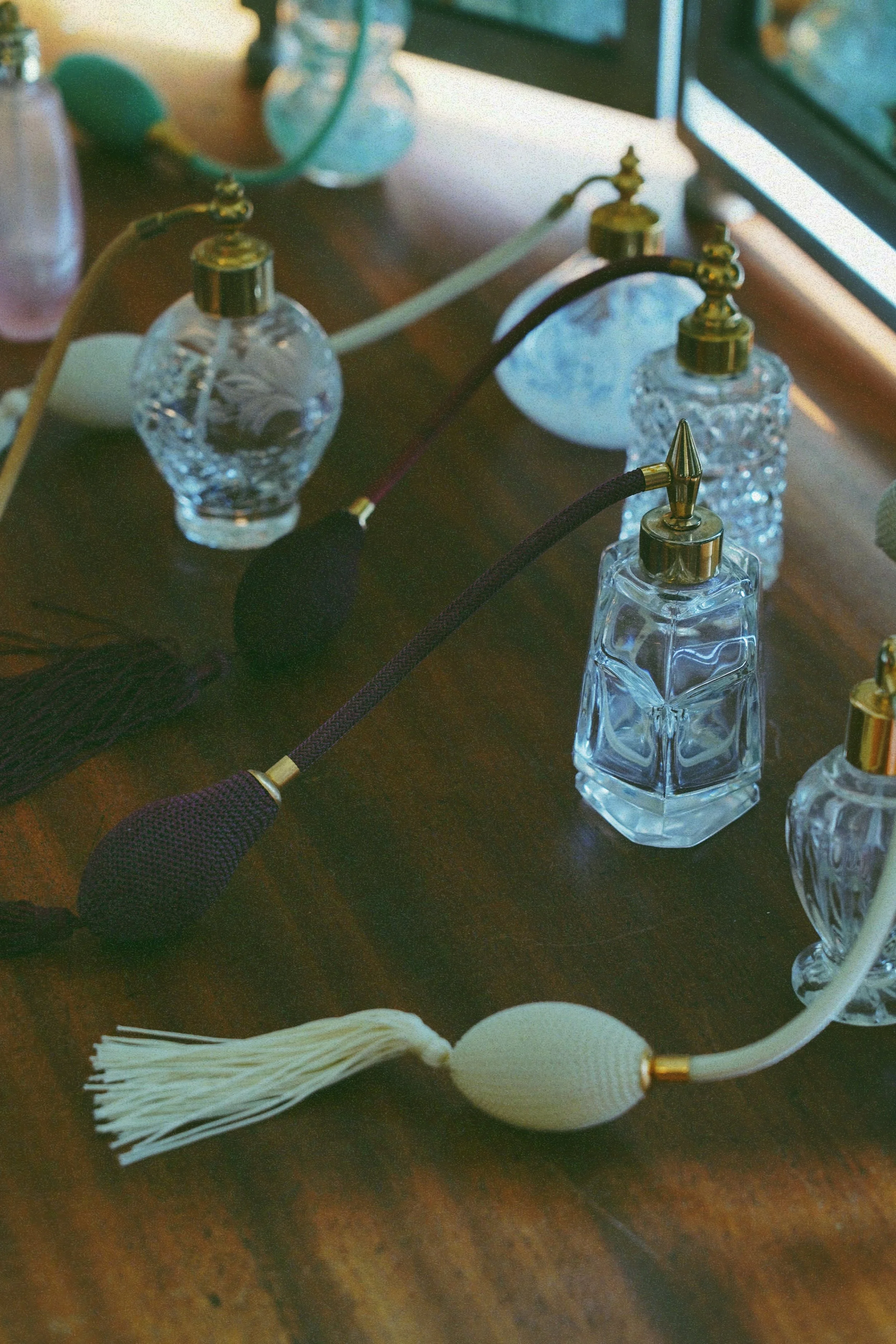
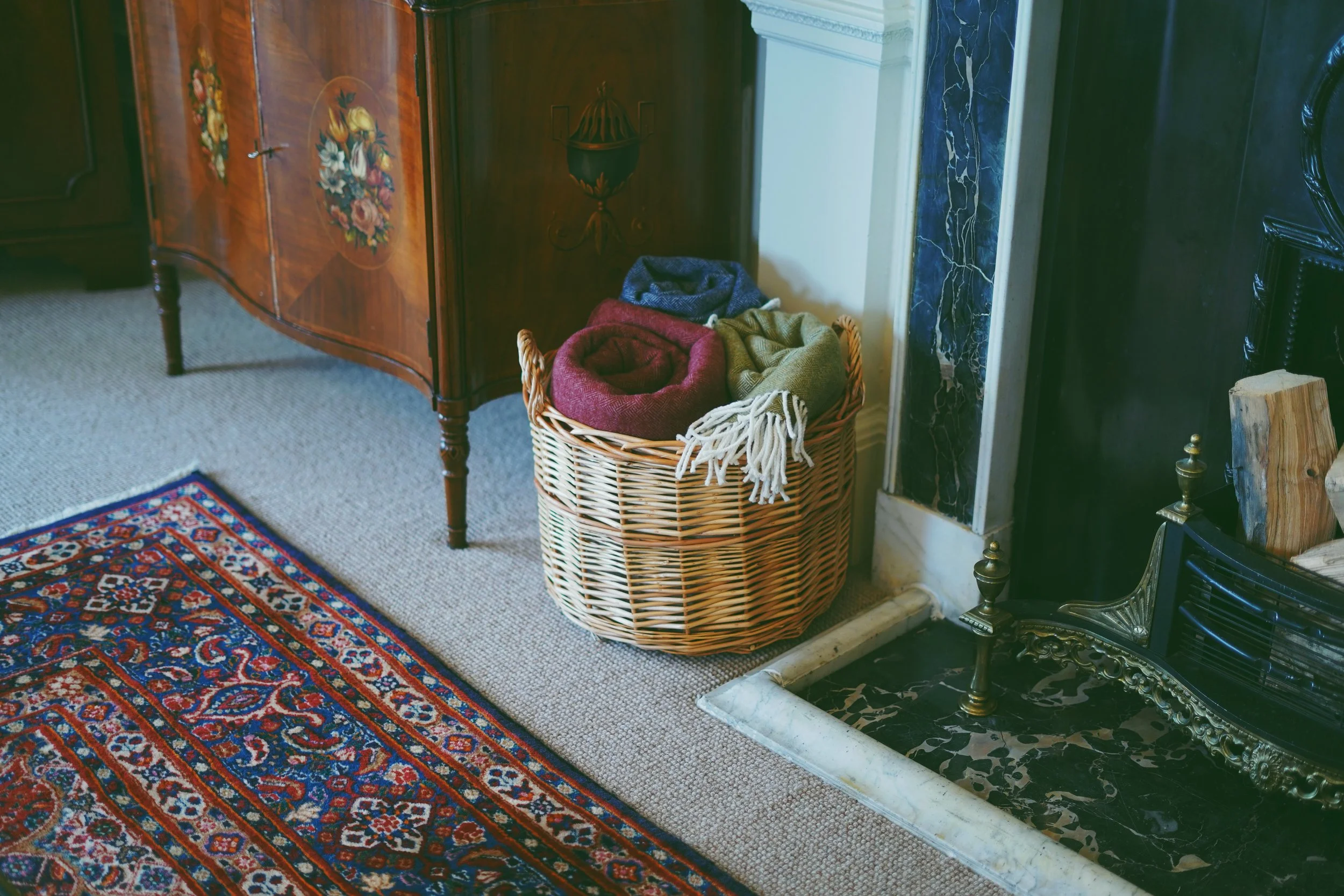
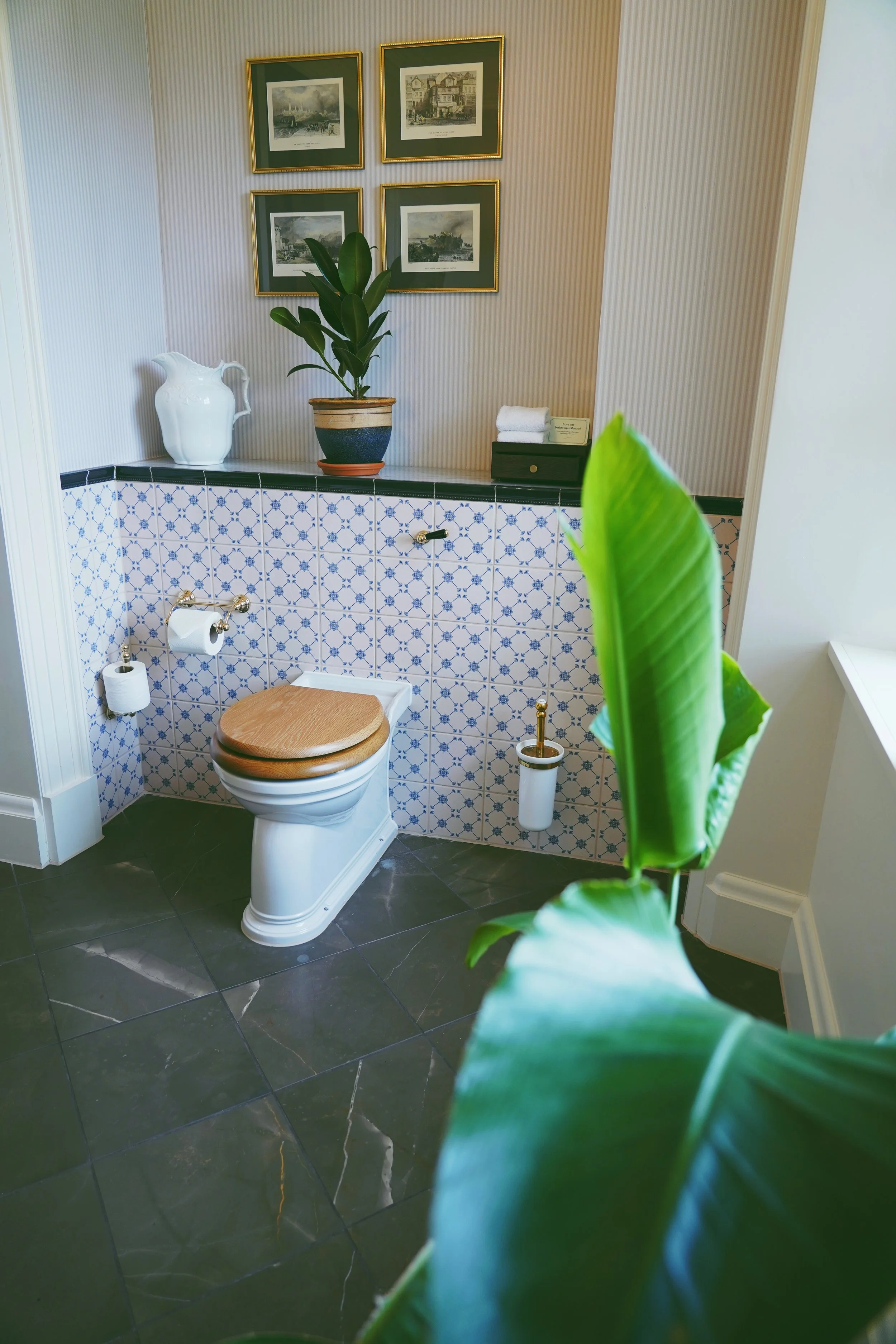
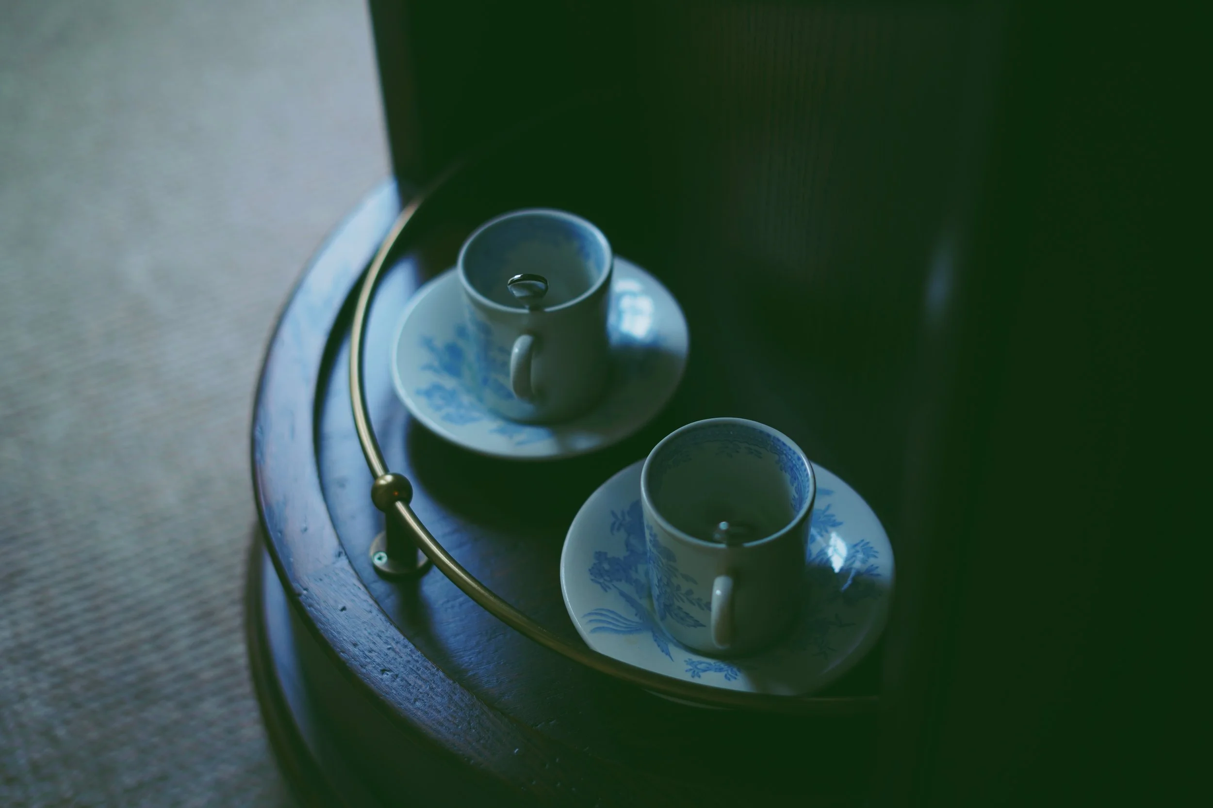
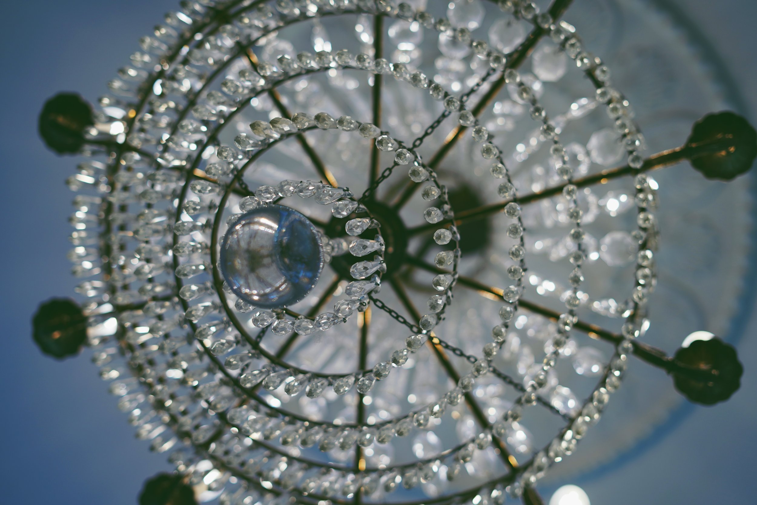
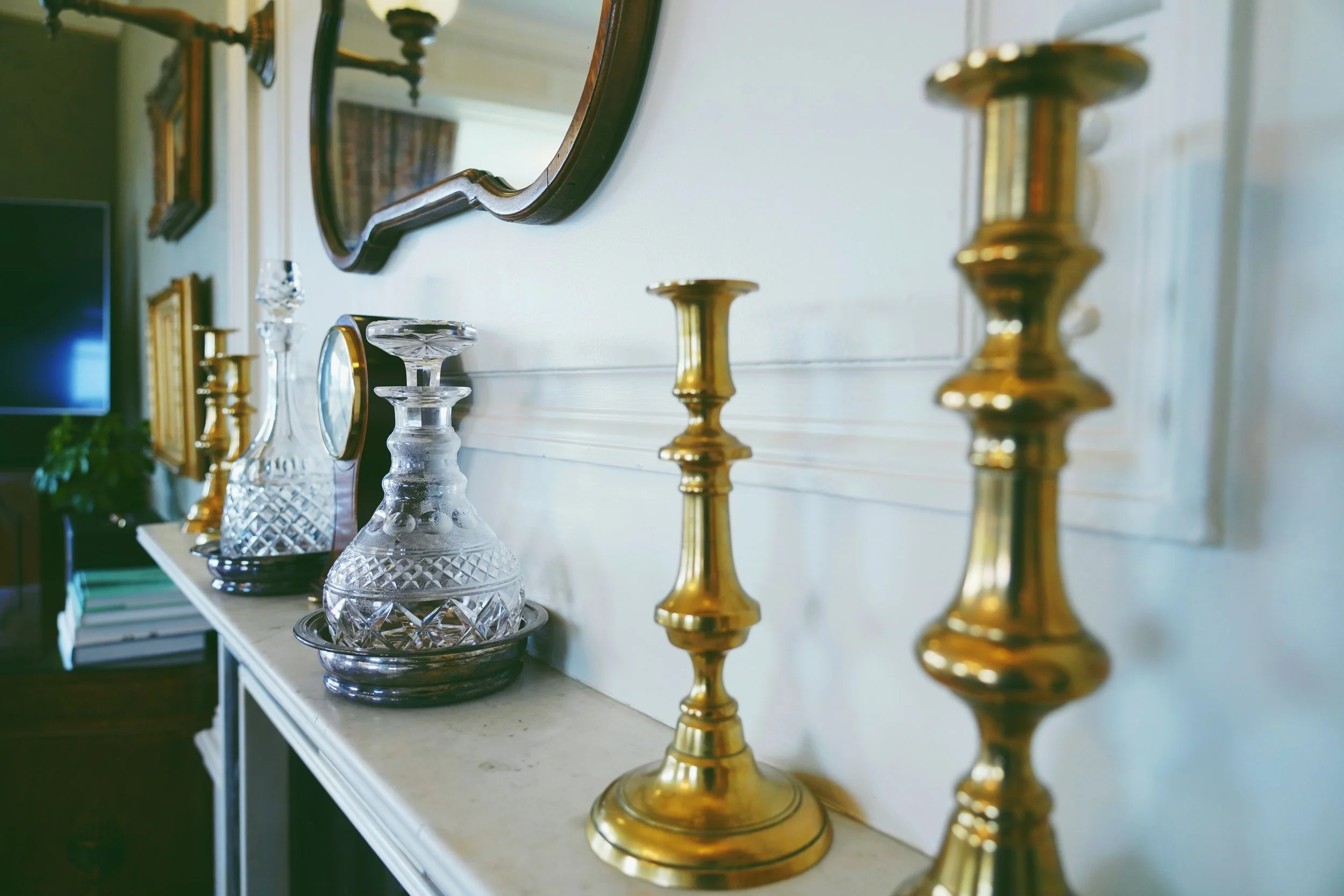
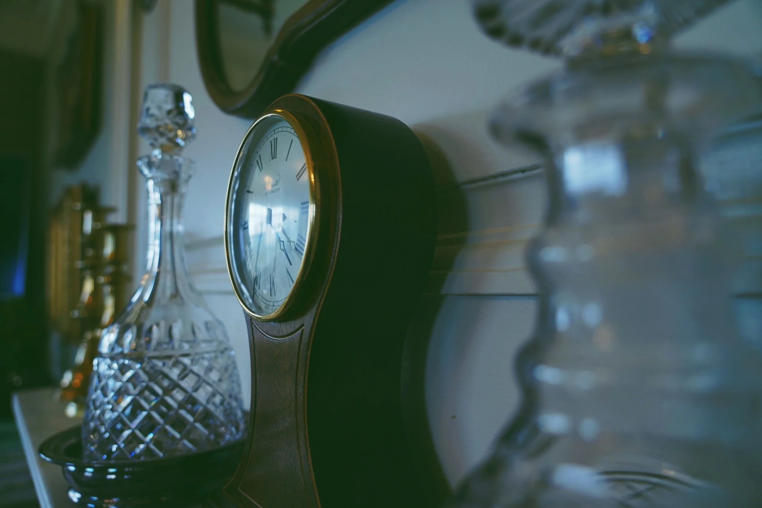
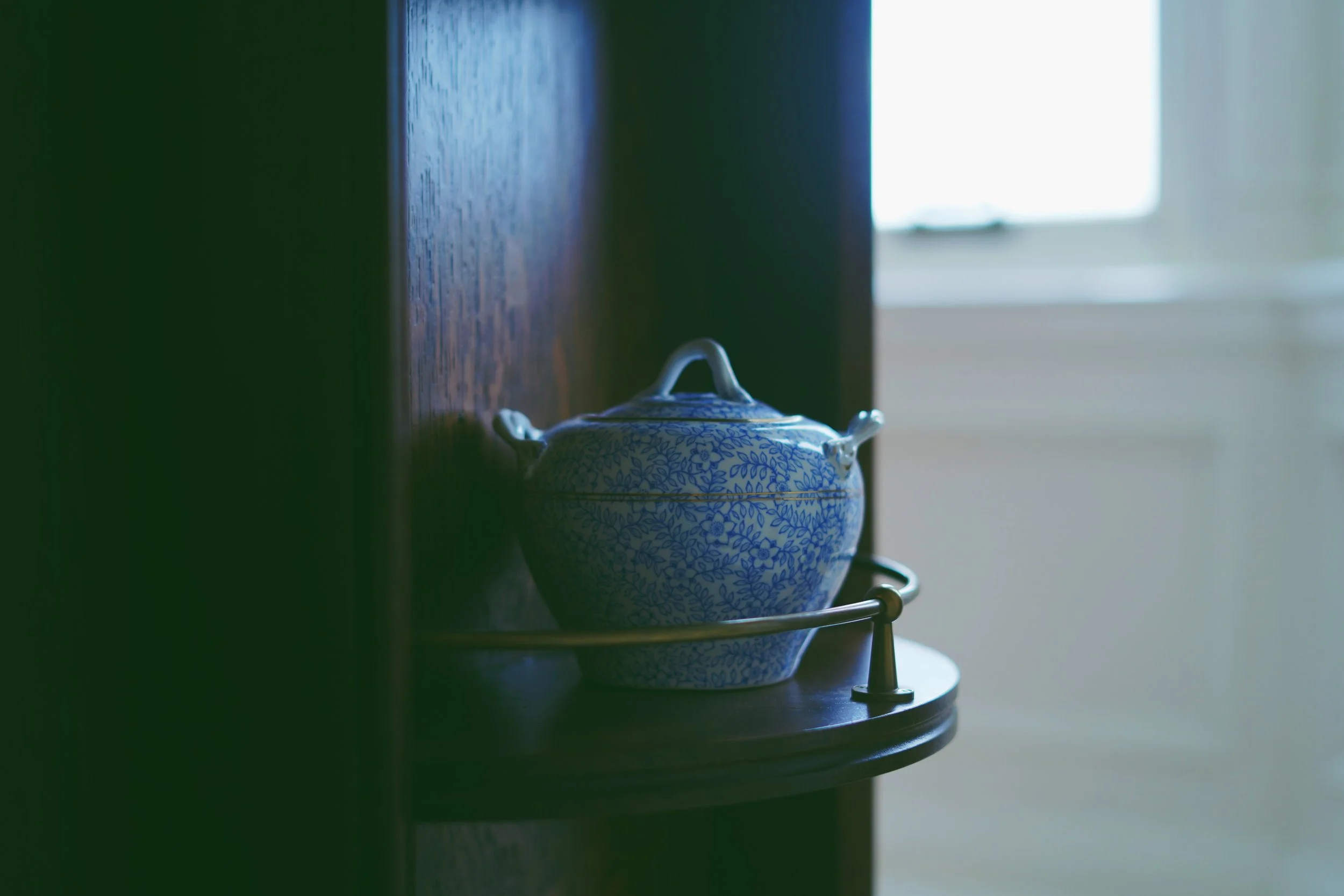
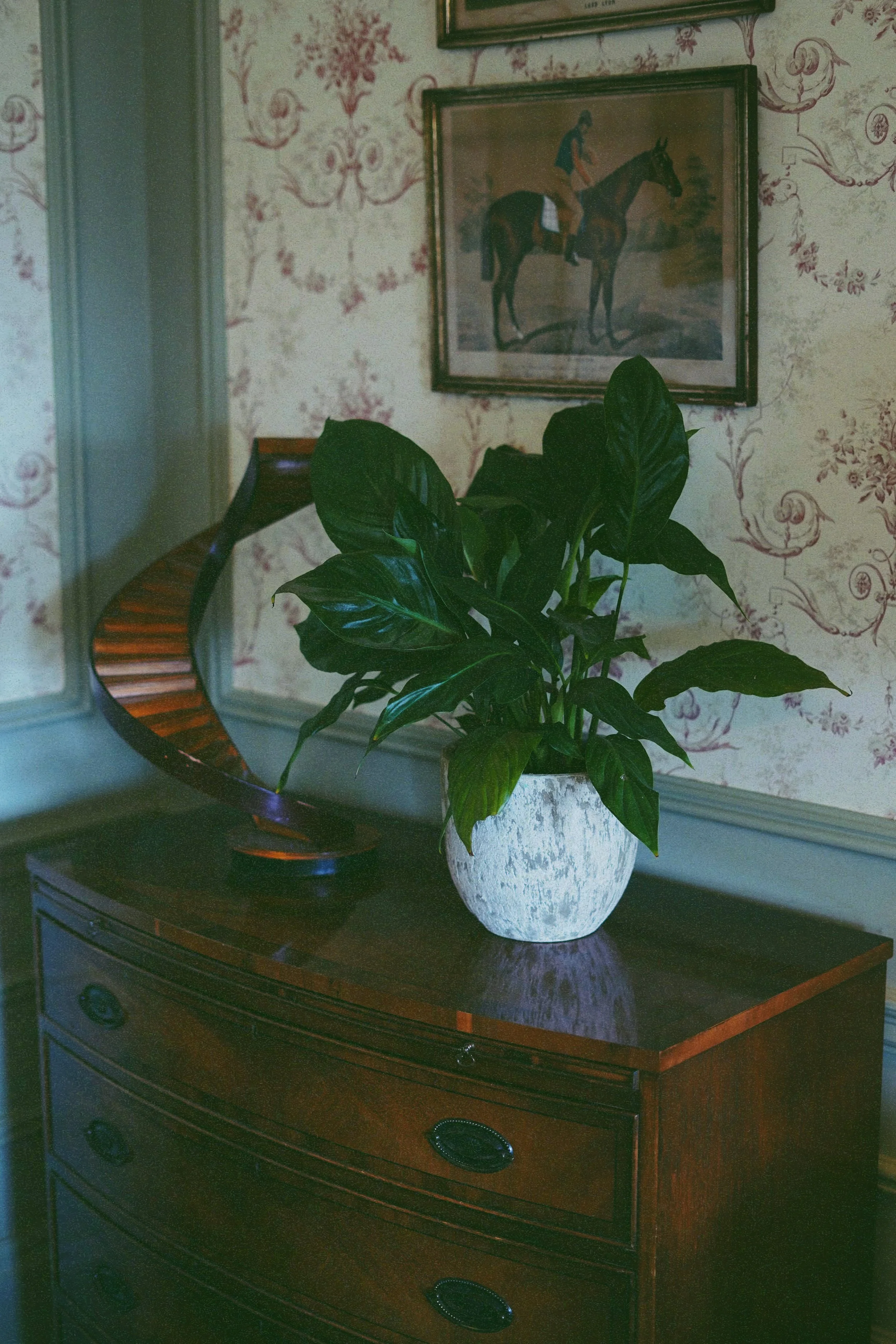
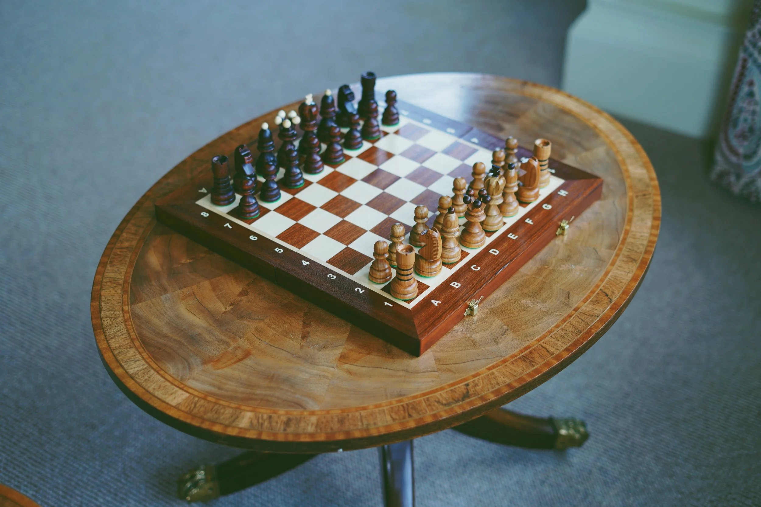
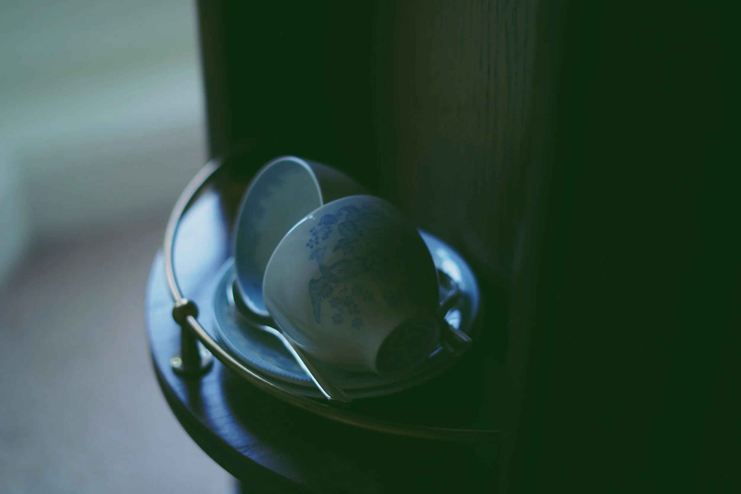
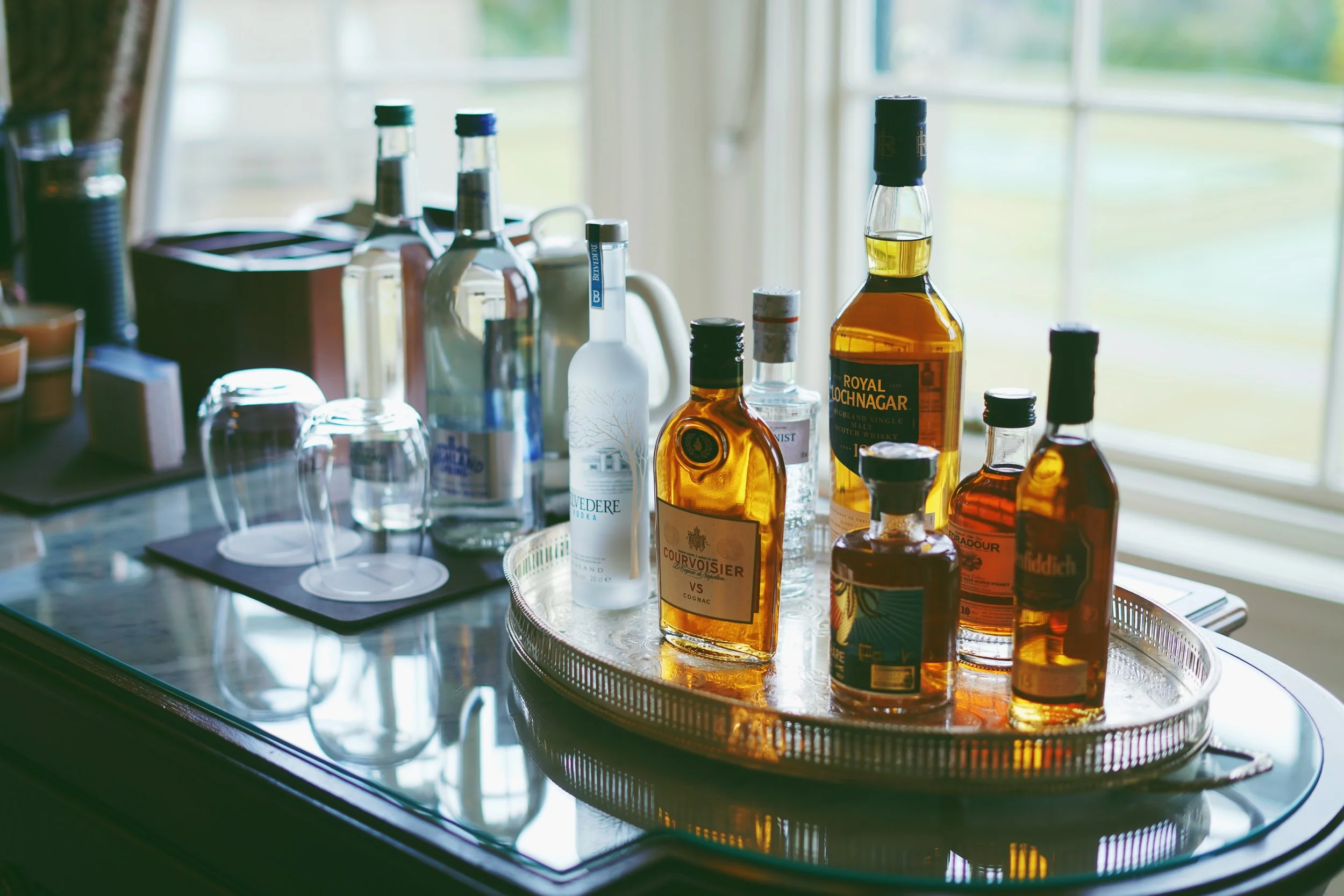
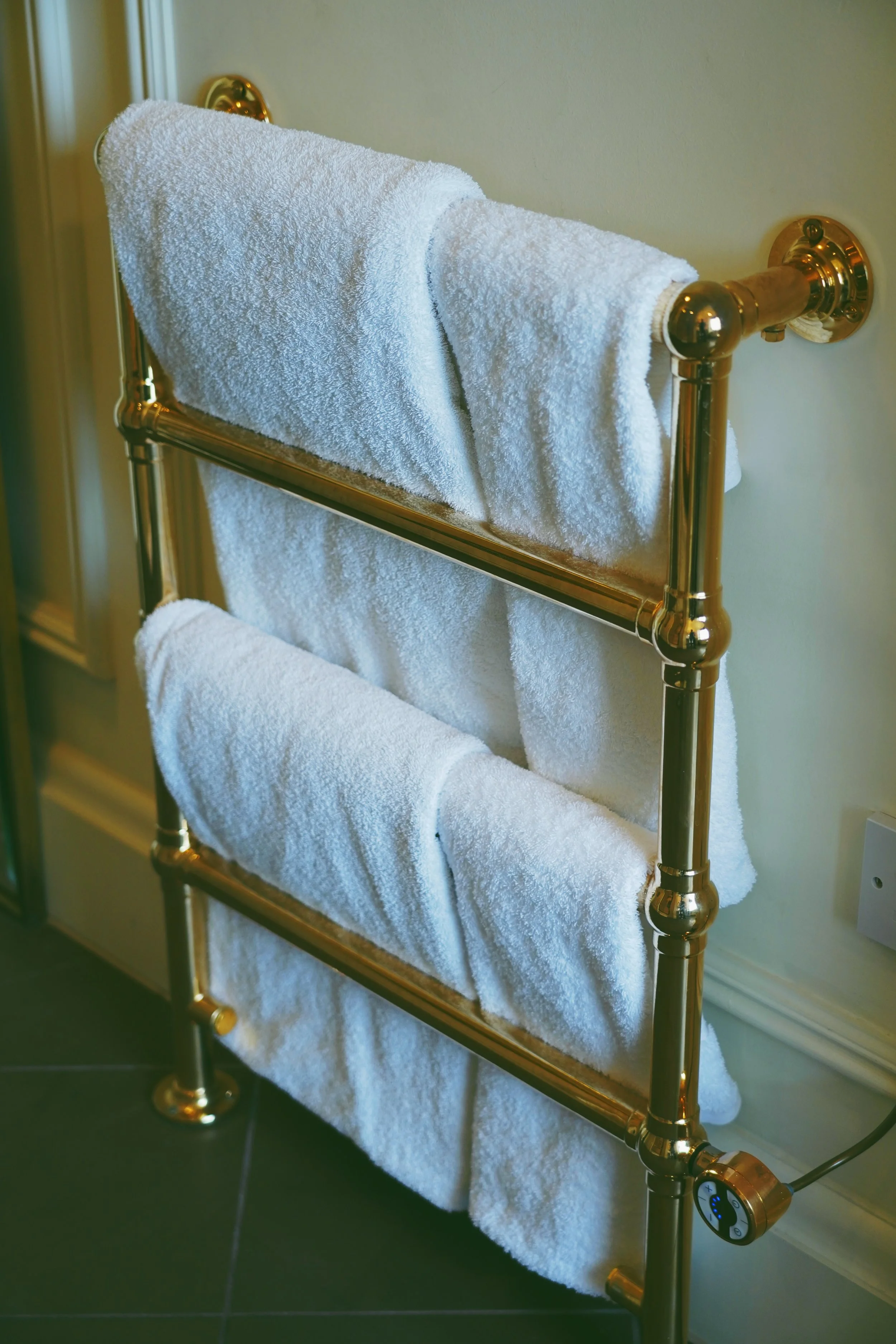
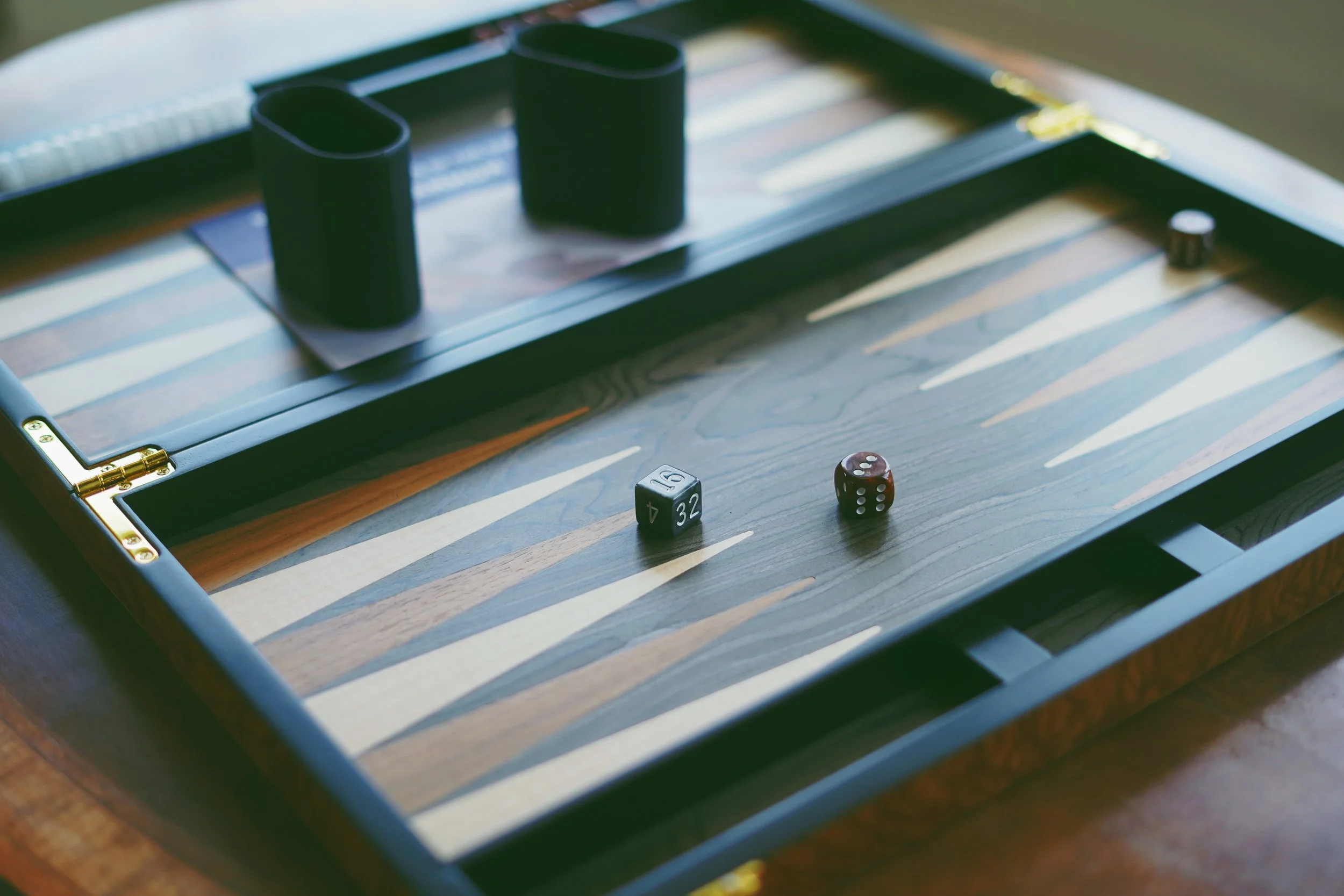
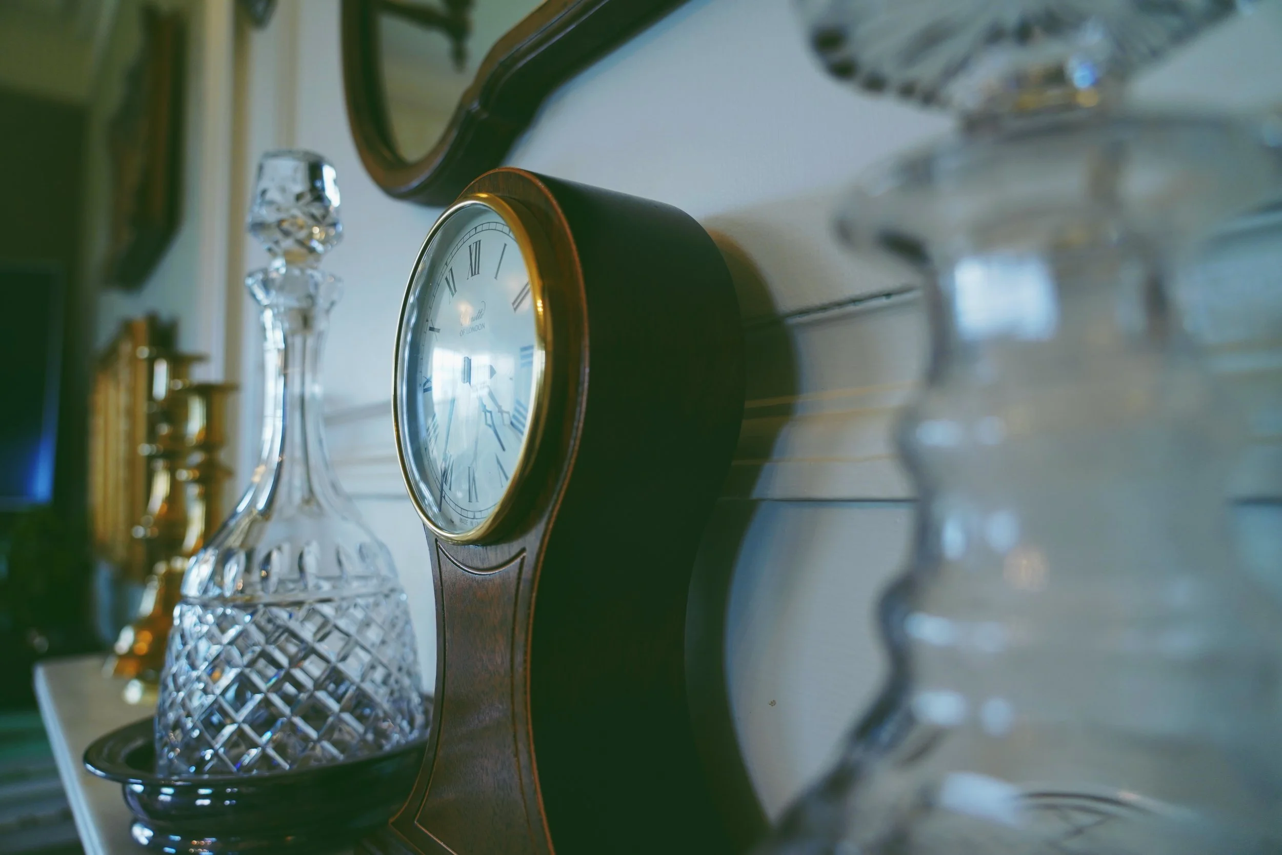
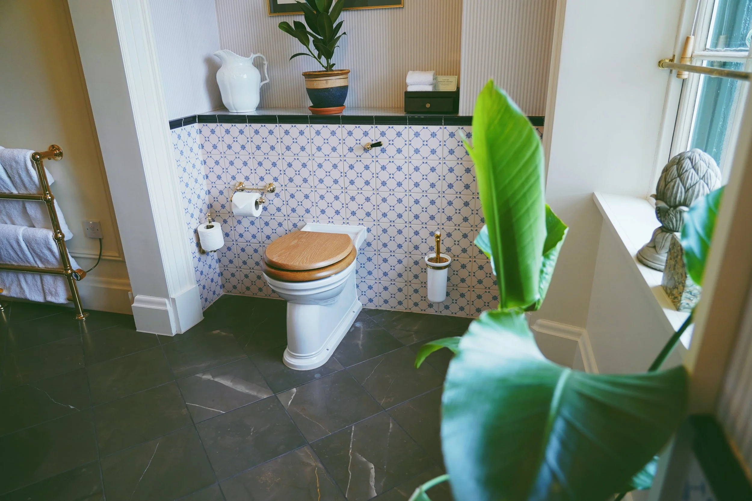
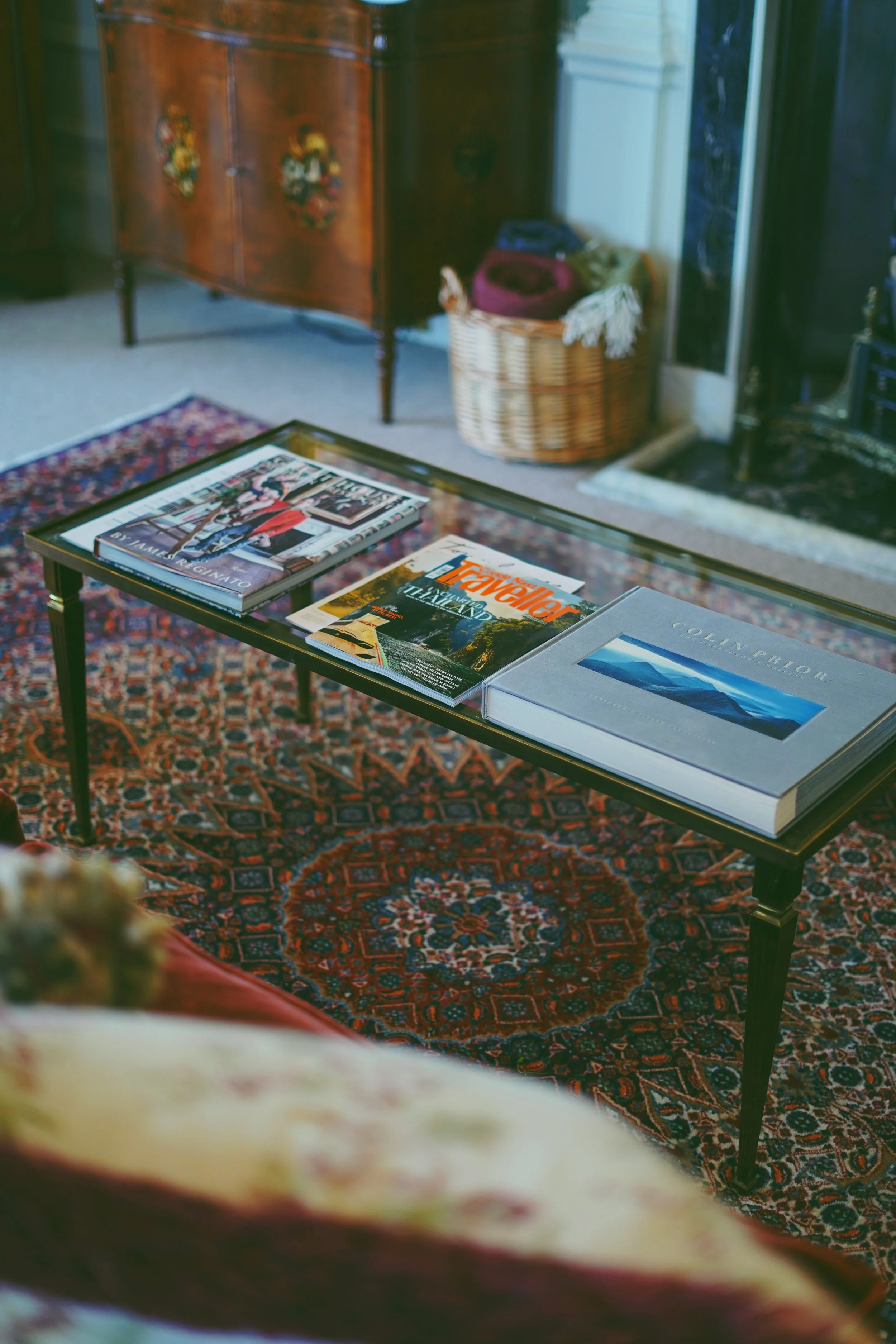
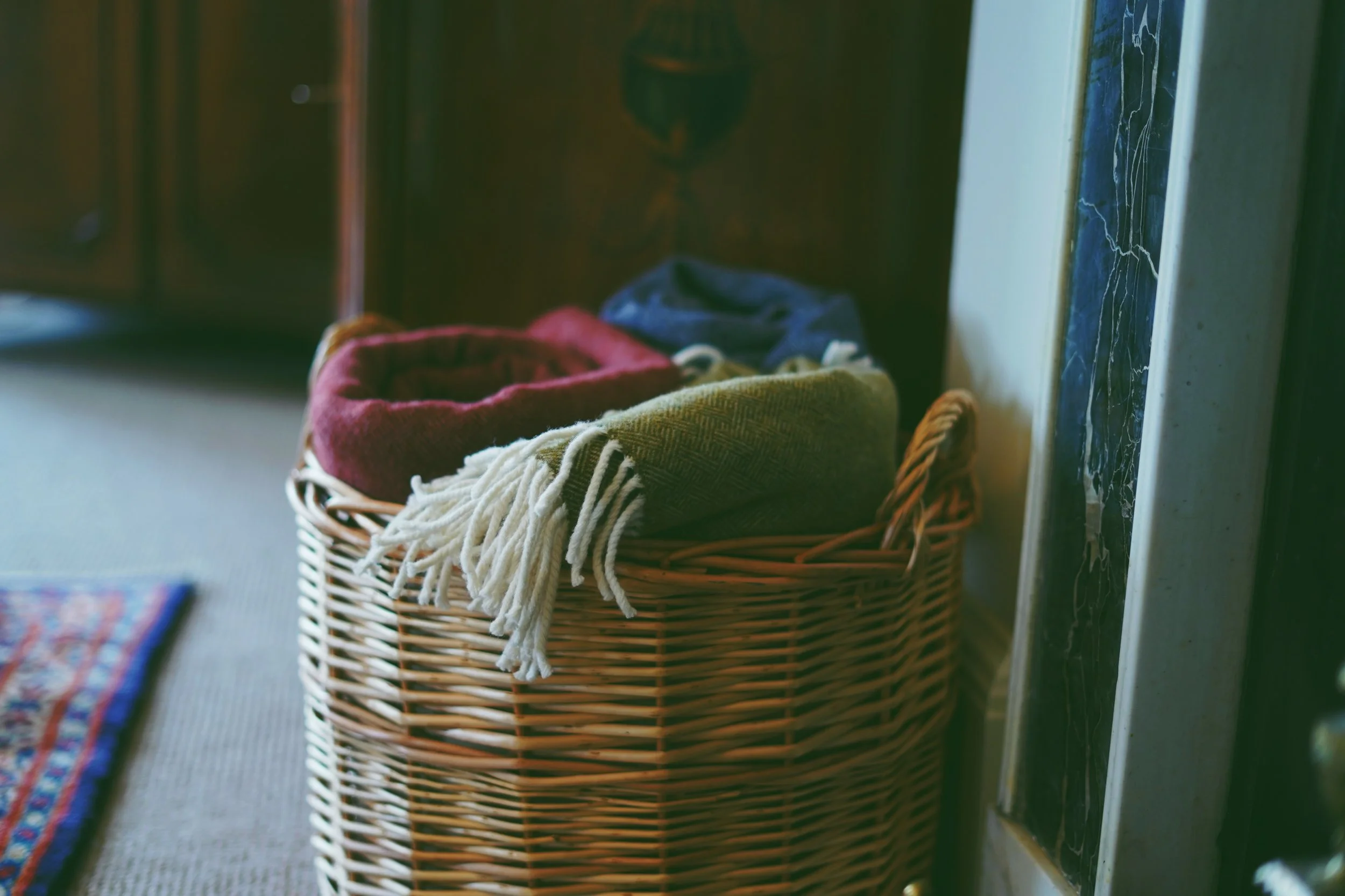
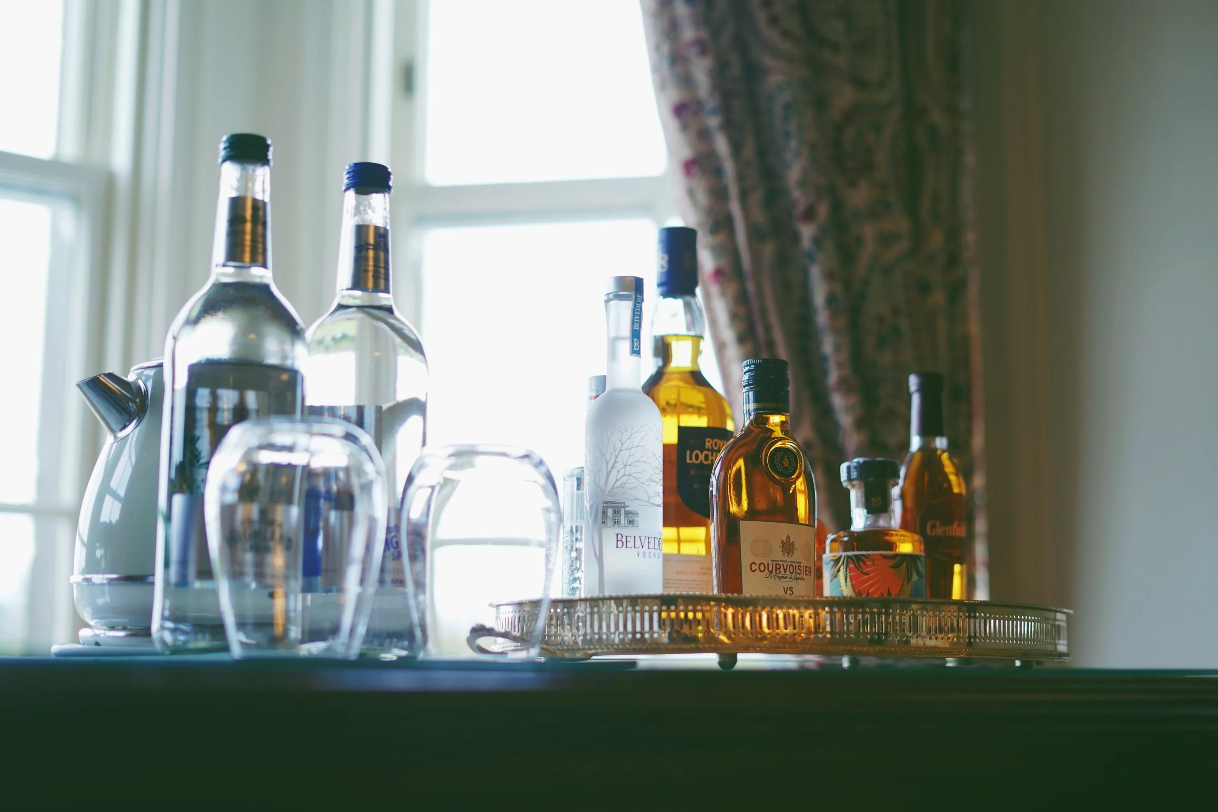
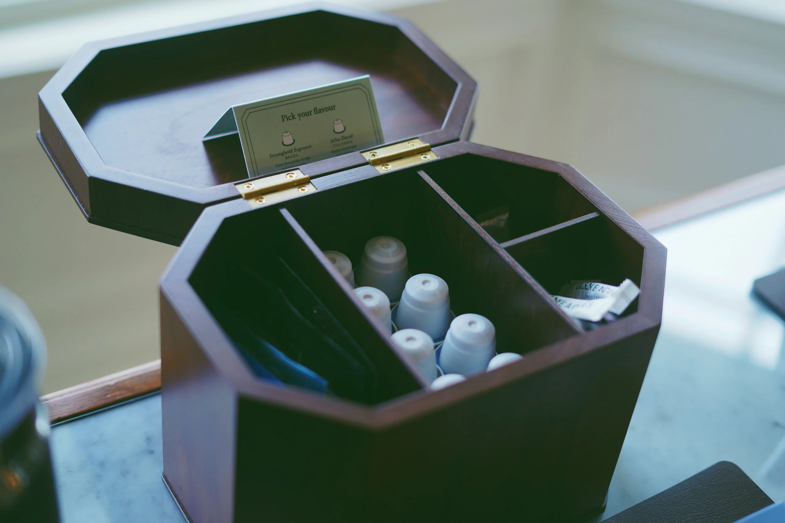
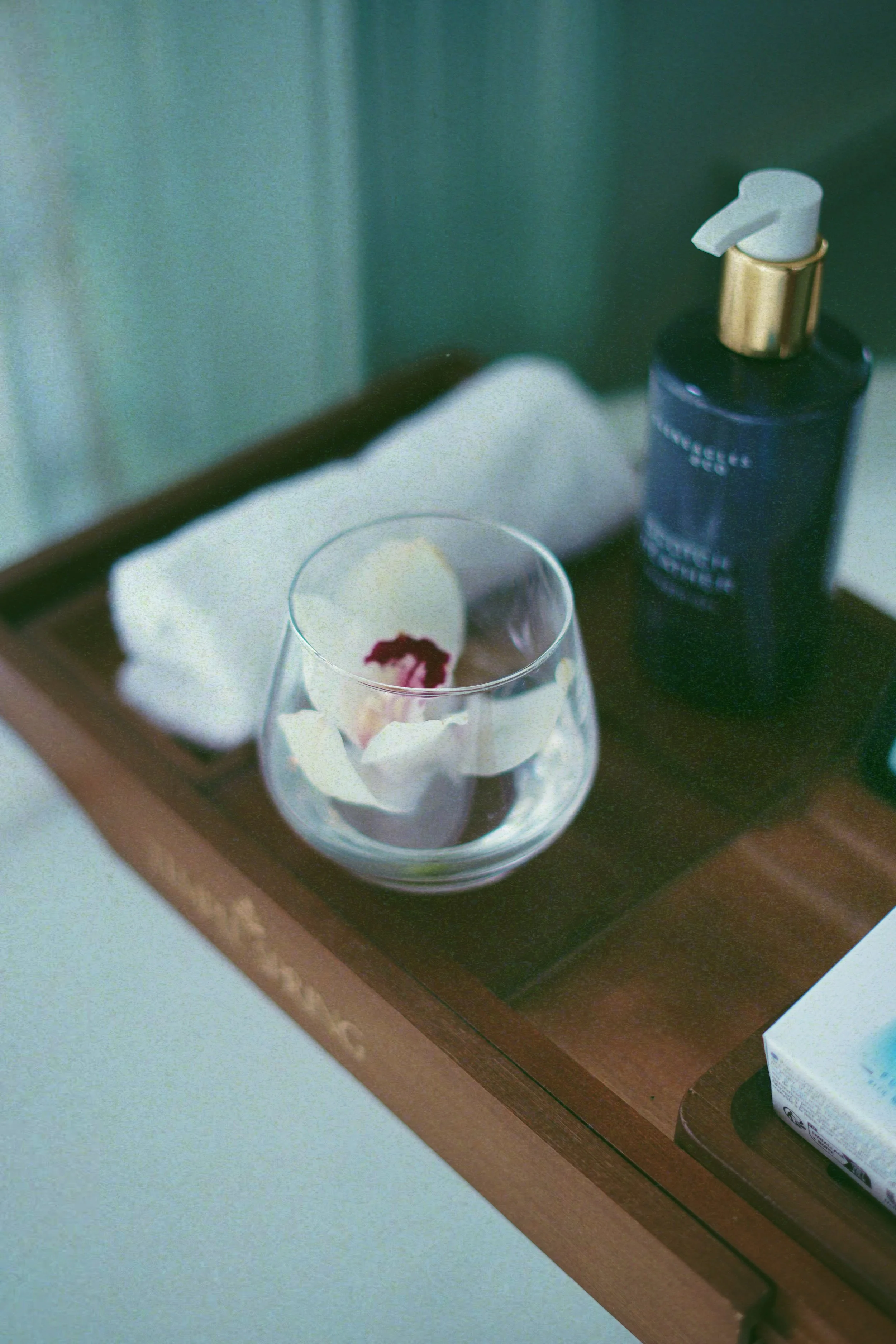
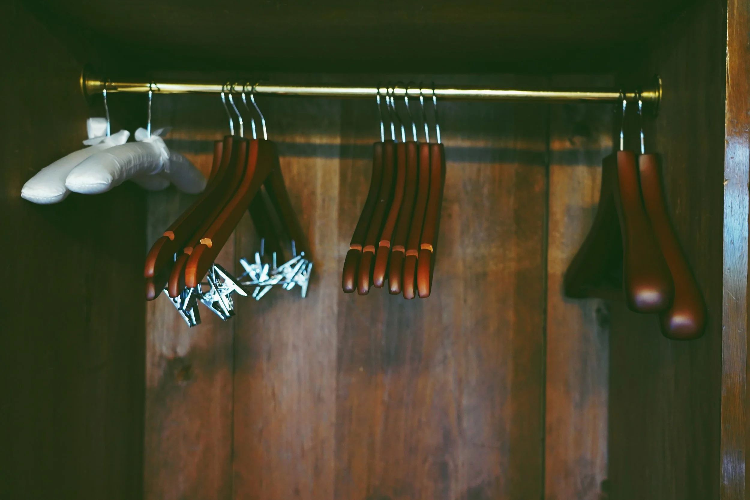
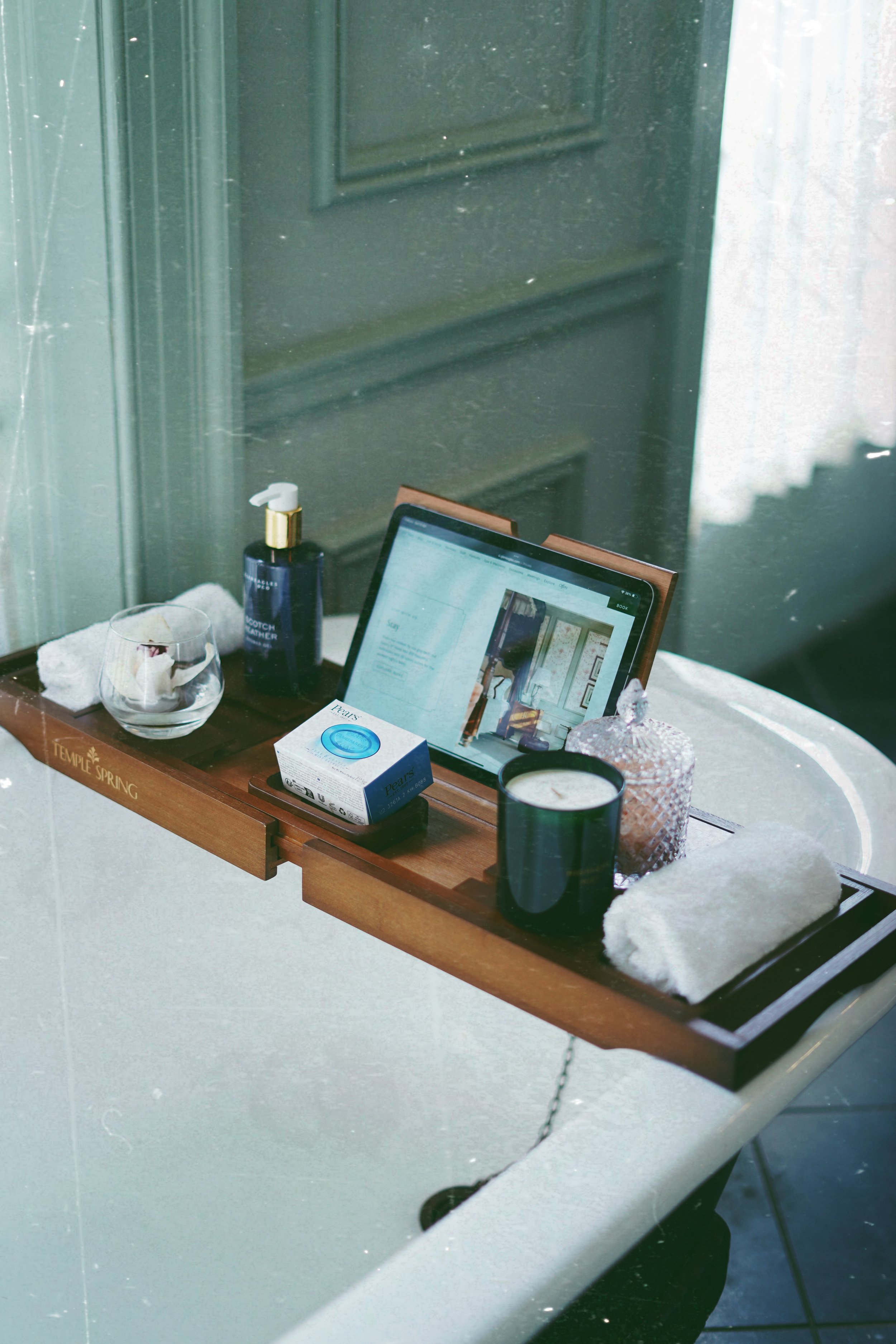
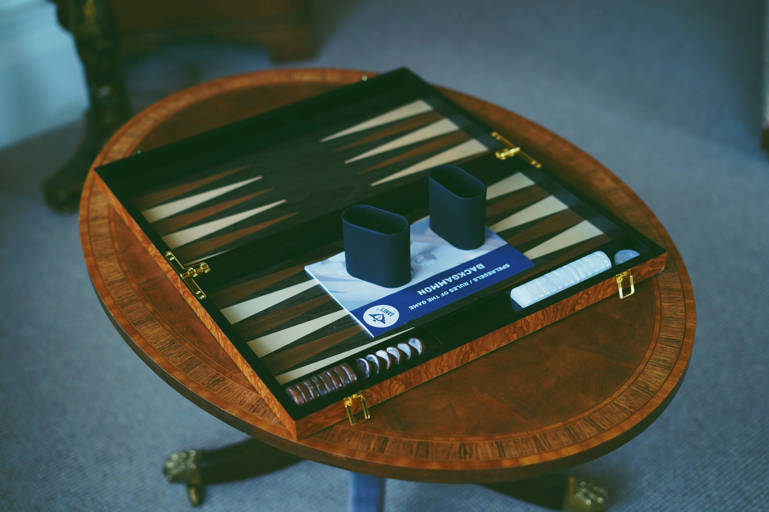
From a planning perspective, I approached the rooms as environments rather than static interiors. The goal was to capture how the space feels when occupied, not just how it looks when styled. I paid close attention to balance, symmetry, and negative space, allowing the architecture, textures, and furnishings to speak without distraction. Composition was kept clean and deliberate, with each angle chosen to reinforce clarity and calm.
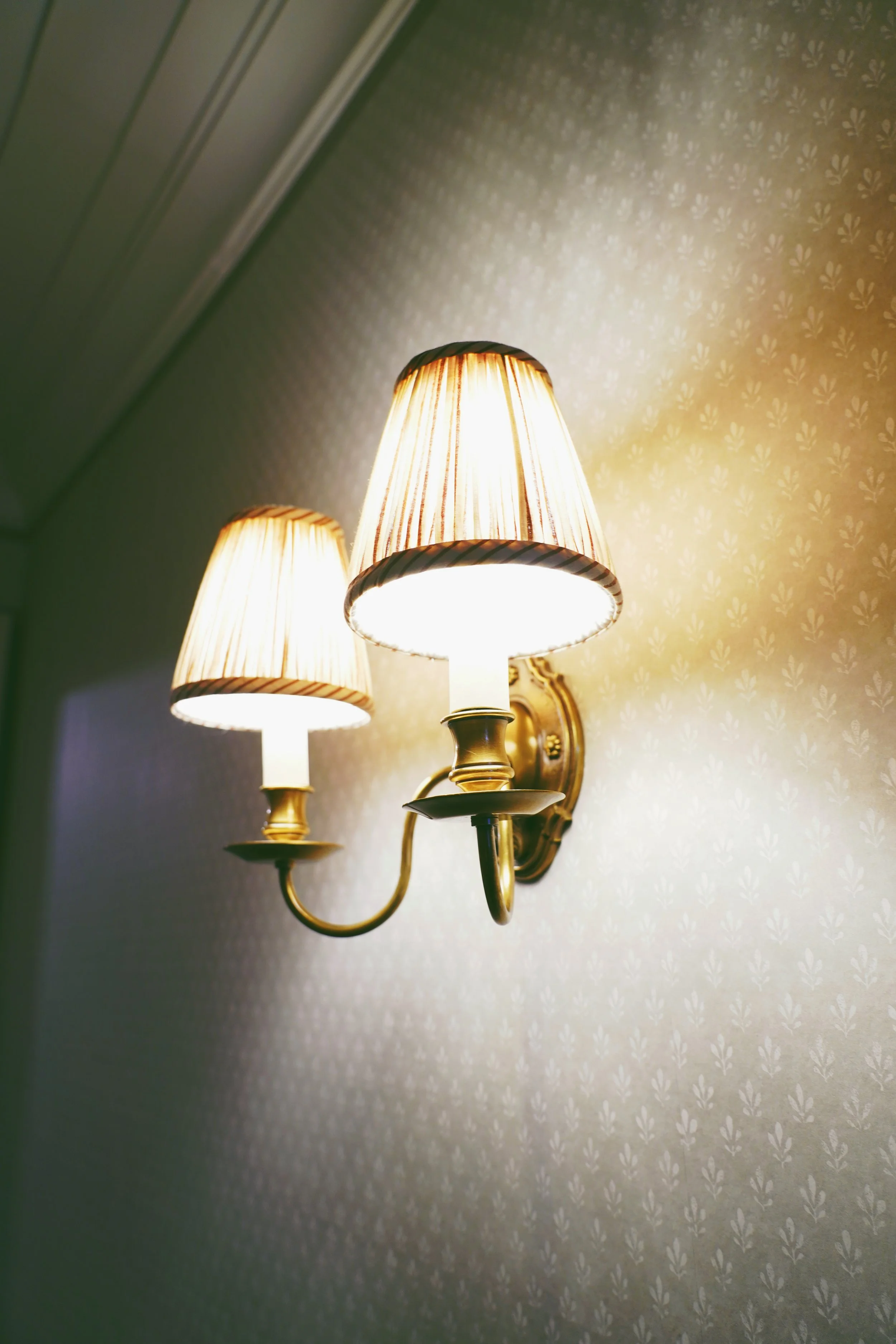
Lighting played a critical role. Rather than forcing brightness or contrast, I worked with the existing light to preserve the atmosphere of the rooms. The intention was to maintain softness and depth, ensuring the images felt inviting while still refined. Artificial lighting was controlled carefully so it enhanced the space without flattening it.
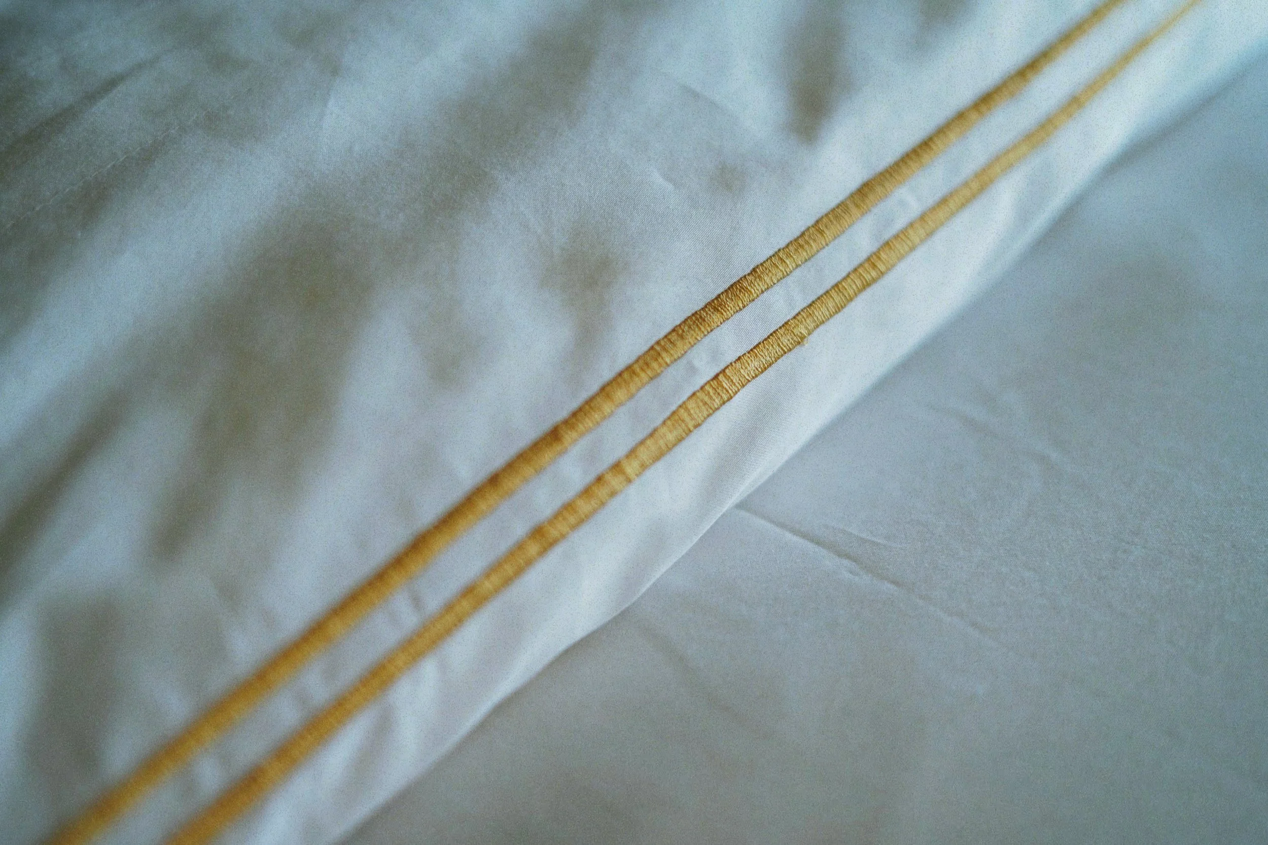
Color grading was treated as a defining element of the project. The palette needed to feel warm, understated, and cohesive across the entire set. I avoided heavy contrast or stylized tones that could date the images or distract from the interiors themselves. Instead, I developed a consistent color treatment that enhanced natural materials, fabrics, and finishes while maintaining a sense of restraint. This ensured the final images felt unified and aligned with the hotel’s identity.
Execution was structured and methodical. Each room was photographed with a clear visual hierarchy in mind, ensuring the final selection could work together as a cohesive series rather than isolated images. This was important for internal presentations, where consistency across visuals directly affects how polished and professional the department appears.
Post-production was approached with the same level of discipline. Retouching was subtle and intentional, focused on refinement rather than perfection. The aim was to preserve authenticity while elevating the overall presentation. Nothing was over-processed. Every adjustment served the larger narrative of luxury through simplicity.
The final outcome was a collection of images that reflected the department’s vision and met the expectations of senior management. The visuals communicated confidence, control, and attention to detail—qualities that matter just as much internally as they do in external marketing. The work supported the department’s position by showing a clear understanding of brand standards and visual consistency.